Accurate, engaging, and effective science & health communication is of the utmost importance, especially with the rise of mis- and disinformation. Scientifically accurate information can oftentimes be inaccessible to general audiences. Pairing complex data with engaging visuals and employing effective communication techniques can transform esoteric statistics and figures into accessible insights. This process is known as information design and is incredibly useful for the health communication field.
Why use information design in science and health communication?
Information design focuses on communicating information effectively, which often includes special attention to accessibility for the target audience, data visualization, and visual storytelling. For science and health communication, this target audience can include healthcare providers, medical science liaisons (MSLs), patients and laypeople. Knowing your audience is key, and determines how to best present complex data. Some important considerations include the following:
- Who is your target audience? What is important to them?
- How familiar is your audience with the content?
- To best serve the needs of your audience, should medical jargon be included, or replaced with plain language?
- What existing communication barriers make information difficult for your audience to understand?
- How will your audience receive this information (i.e. a static infographic, a video with voiceover, an interactive application, etc.)?
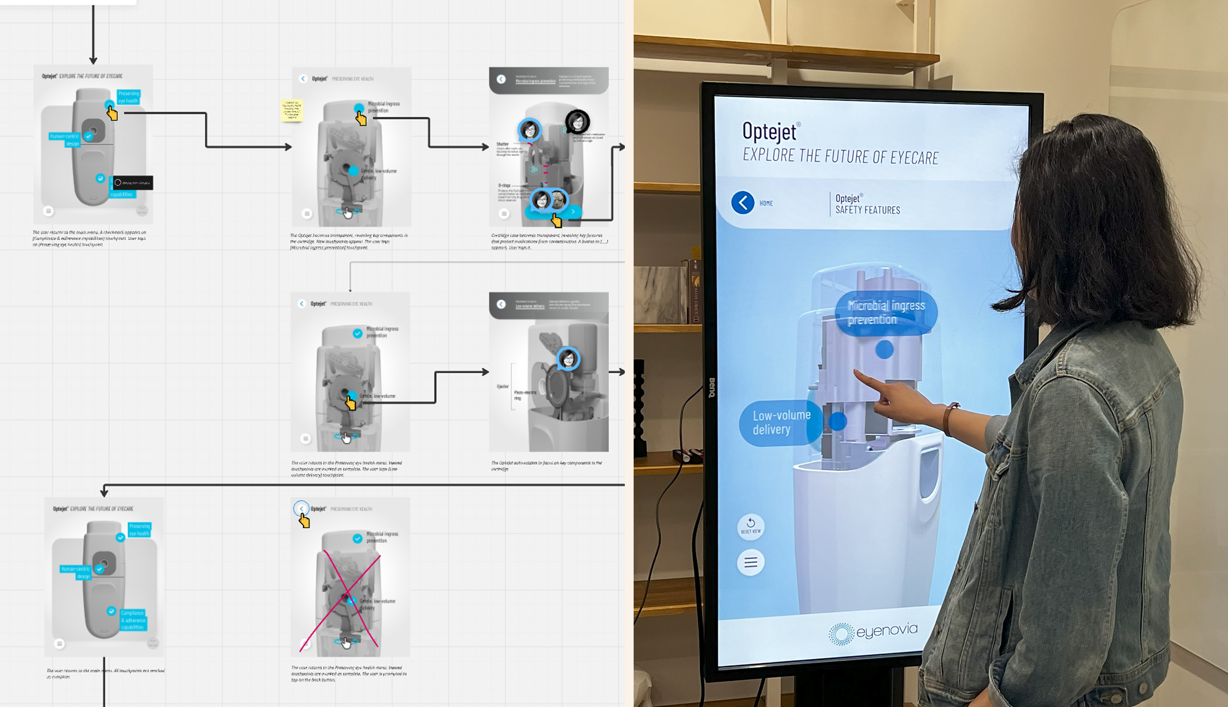
This medical device simulator was designed for eyecare professionals to learn about a new drug delivery technology. While this audience is highly knowledgeable about eye physiology and disease, the information presented dealt with unfamiliar concepts and therefore had to be carefully scaffolded to optimize learning in a short amount of time. On the left is a portion of the design wireframe, in which the flow of information and user interactives were thoughtfully planned out.
Data visualization in science and health communication
Data visualization is a key component of information design, illustrating information meaningfully to your audience. The visualization of health data must be comprehensive:
- What are common visualization techniques for this data set (i.e. bar graphs, scatter plots, etc.)?
- What level of knowledge is needed to comprehend these visualizations?
- Can the information be simplified while retaining accuracy?
- What additional information will aid the audience in understanding (i.e. a legend, key, or description)?
- How can we make this health data visualization more accessible?
- If interactive, are the buttons large enough for people with dexterity or mobility issues?
- Is there enough visual contrast between the text and its background for optimal readability?
- Is colour always used with text to convey meaning? Will the visualization be easily understood by people with colour blindness?
- Are text sizes large enough for people with limited vision?
- Is the content described using plain language?
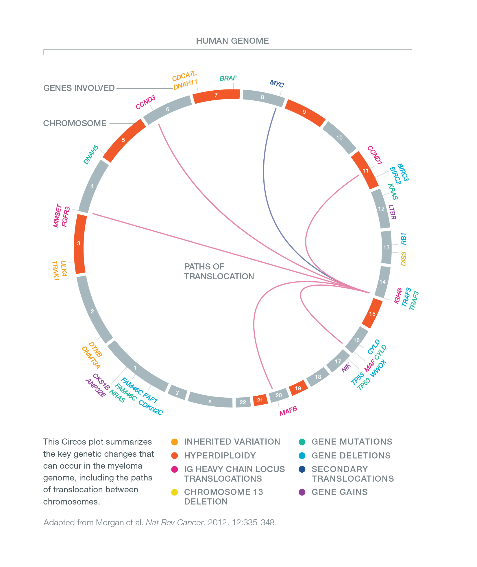
The genetics of multiple myeloma is complex and varied from patient to patient, making it well suited to visualization using a Circos (circular visualization) plot. Circos was invented by scientist Martin Krzywinski to visualize complex genomic datasets.
Drug development pipelines and clinical trial navigators like this one are excellent examples of information design. They involve significant amounts of data that must be presented in a highly organized manner and easily filtered by users—often physicians looking for clinical trial information.
Information design goes hand-in-hand with storytelling
While clean and accurate health data visualizations are effective for conveying complex data, that information needs to be communicated in a way that resonates with your audience. For effective information design, your data is only as good as the story it tells. Storytelling in health communication leverages an intrinsically human trait, making it an effective way to engage your audience. It builds an emotional connection between the data presented and the impact it can have on the audience, which offers greater significance than just the data alone.
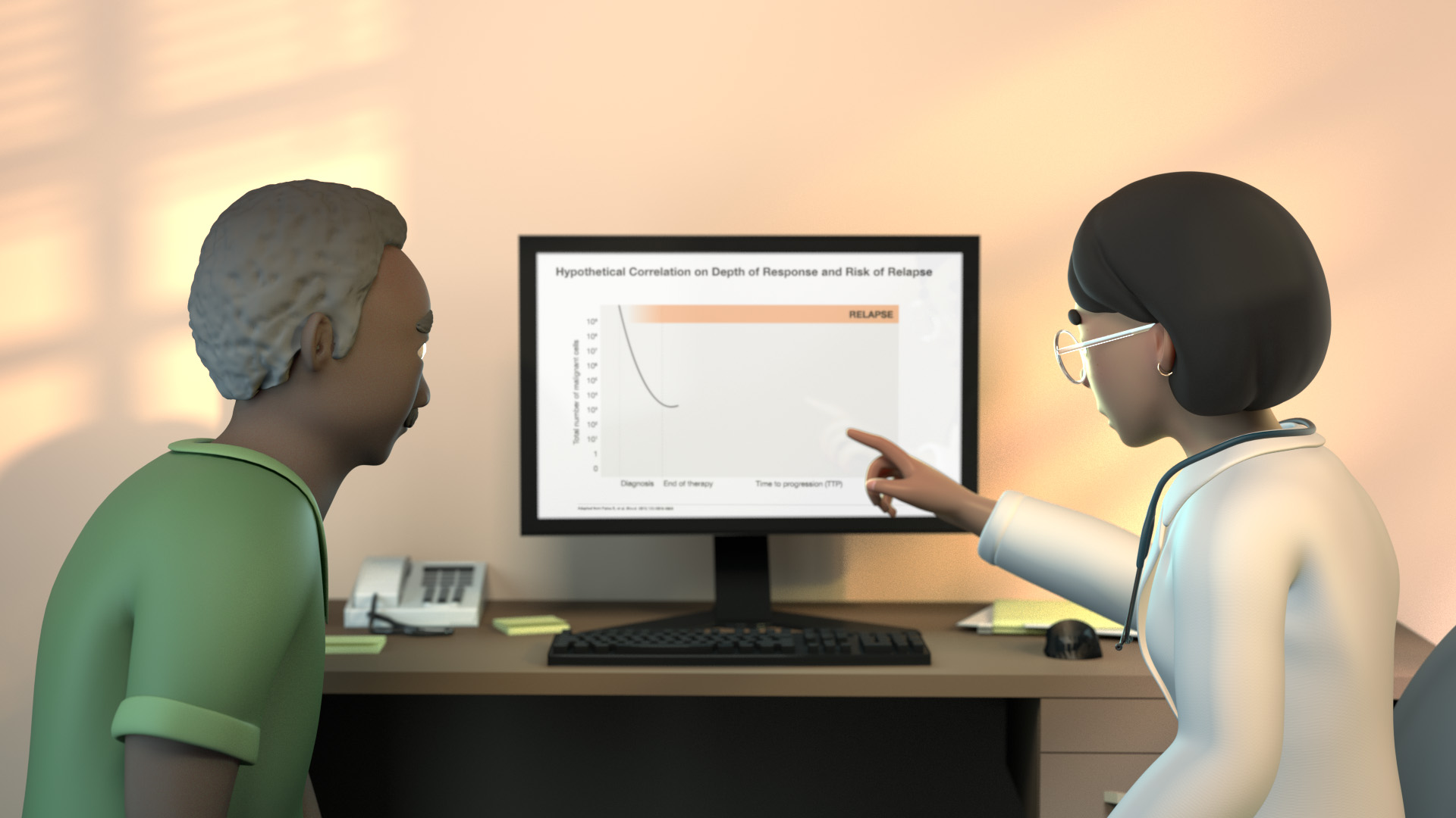
This image is from a medical animation about minimal residual disease. To make it relatable to medical oncologists and patients, we presented the content as a story of a patient discussing their cancer treatment and prognosis with their doctor.
As you design a story to present your information, including data visualizations, consider the following:
- What is the problem or context for the information being presented?
- Will this story meet the needs of your target audience and what is important to them?
- How can you integrate data visualizations you’ve created into the storyline?
- What are the main takeaways for the audience? Is there a final call to action?
Visual metaphors in information design
Visual metaphors can be particularly useful in information design because they help people understand abstract or complex concepts in more familiar terms. Visual metaphors can create associations between new information and familiar ideas. Using common visual language, metaphors can also make health data visualization accessible to a wider audience. A visual metaphor can also help with story structure. For example, we represented the relevant anatomy and pathways as a factory in an animation about nutrient processing. This allowed us to move about the ‘factory floor’ from organ to organ as we progressed through the story.
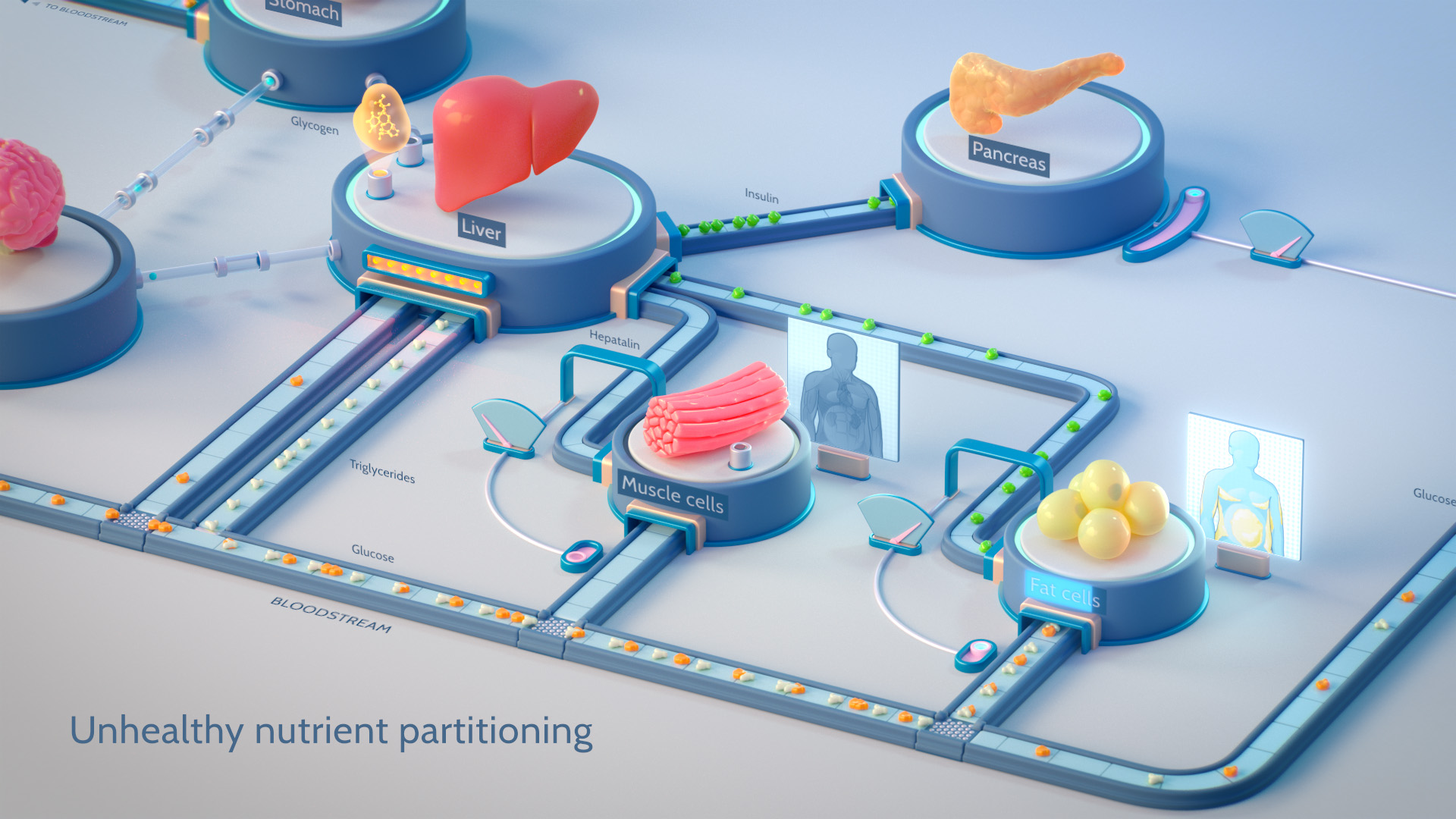
This image is from a scientific animation about hepatalin, its role in nutrient partitioning, and its potential impact on type 2 diabetes care and prevention. The factory metaphor shows the interconnected systems involved in digestion and the downstream effects of changing just one signal. Viewers can easily see how hepatalin levels impact nutrient partitioning to fat and muscle cells and understand the consequences to a patient’s health. Had we presented these organs and signalling pathways in situ, the story would have been more difficult to understand, especially for viewers without knowledge of human anatomy and physiology.
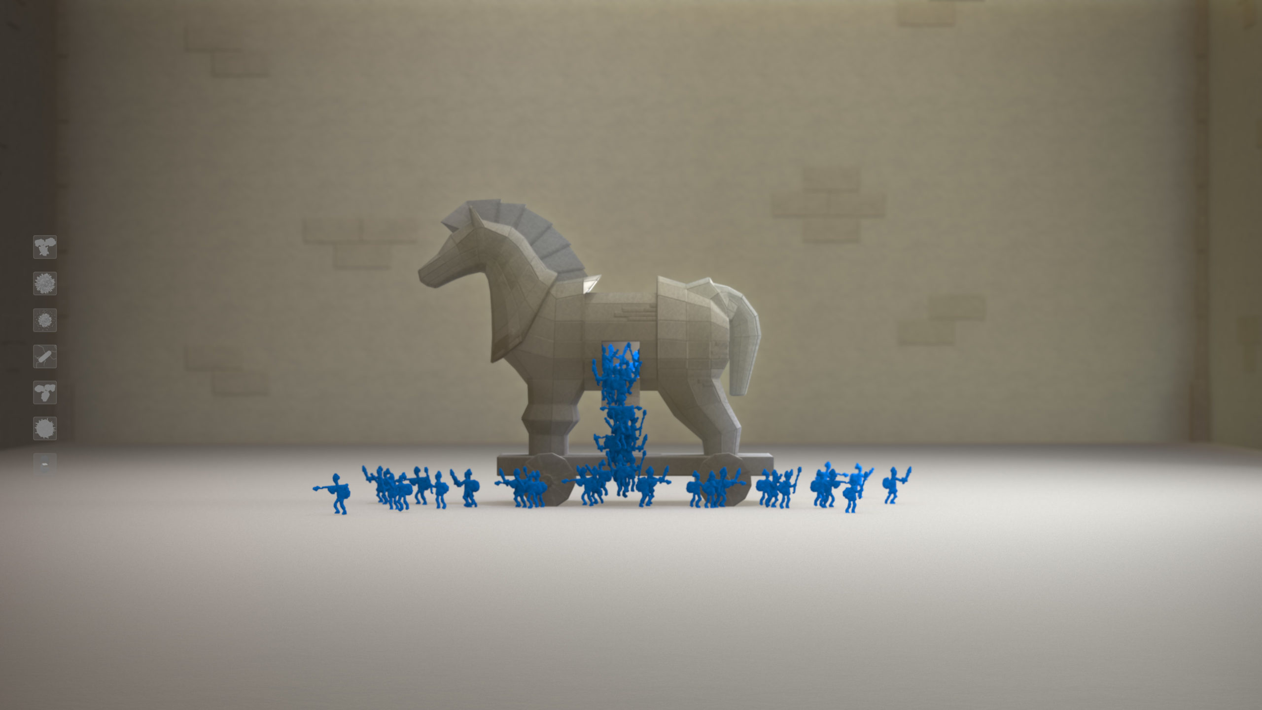
In this medical animation about different approaches to treating cancer, we used the Tojan horse as a metaphor for therapies that slip undetected into cancer cells to attack from within.
While metaphors can be extremely useful in information design for health communication, a few caveats are worth noting. The metaphor must have an obvious and logical connection to your content. If it’s forced or unclear, you risk confusing your audience. Metaphors risk oversimplifying complex subjects. Be sure to take a step back to ensure important information has not been omitted. Finally, some metaphors may not translate well across all demographics or cultures.