Making science easy to understand is not easy. Scientific Communications and Medical Affairs professionals know there’s more to it than translating jargon and distilling data into a presentation. There is also the challenge of designing for how people learn: how they remember and process information. But no matter how well-written or visually striking a presentation is, messages can fall flat or be ignored if the content is difficult to access or read. And while scientific congress booths are a great opportunity to share content and strengthen a brand, communication barriers can happen when we don’t consider individuals with diverse abilities and communication needs. When information is designed and presented in a way that is equitable, flexible, and intuitive, we can expect not only greater understanding and engagement but also impact for a broad range of audiences.
At AXS Studio, we create visual solutions for life science clients that help people understand concepts in science and medicine. Our mission also involves identifying barriers to understanding science—and finding ways to reduce them for audiences, regardless of ability, age, or background. Through our experiences, we have identified the need to develop an iterative and evolving process of evaluation to address these barriers to accessibility so that our clients’ messages reach as many people as possible.
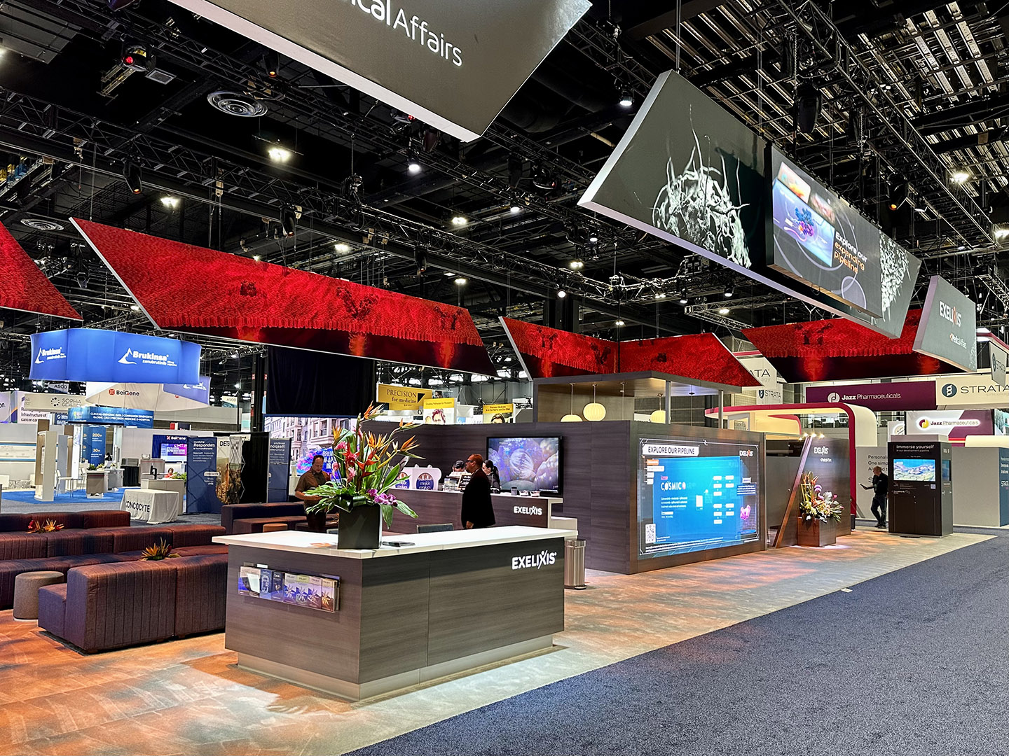
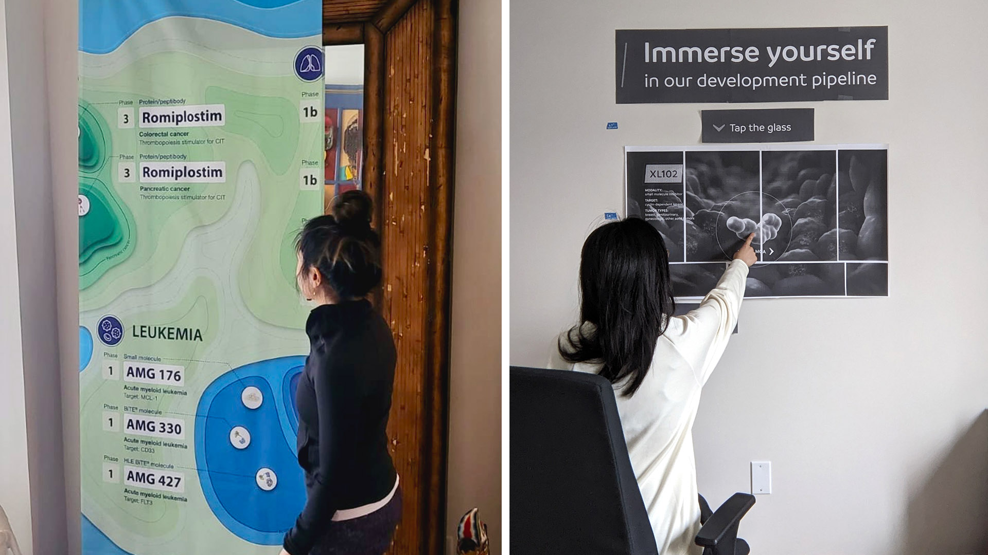
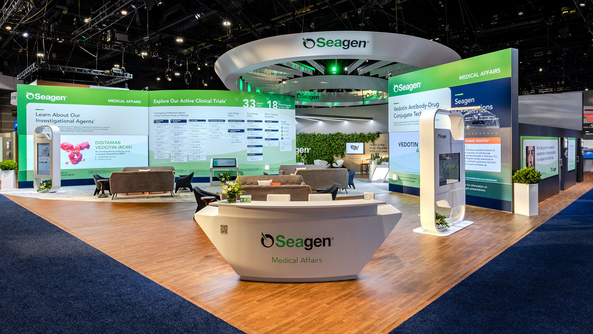
Scientific congress booth. Videos and graphic design by AXS Studio. Booth design, construction, and printed graphics by Slate 360. Technology by D&J Electronics.
We’ve compiled this list of handy accessibility tips informed by lessons learned from designing murals and experiences for scientific congress booths. We hope this can serve as an iterative (and always evolving!) evaluation procedure that can be useful for making your scientific communication projects more accessible!
Accessibility in Visuals at Scientific Congress Experiences
When designing spatial experiences for scientific congress booths, we refer to accessibility museum standards. Museums and cultural organizations serve a large number of people, anticipating the widest possible spectrum of ability, age, culture, and socio-economic status. So as a starting point, we design our congress experience layouts based on accessibility standards set by the Smithsonian Guidelines for Inclusive and Accessible Design, a document referred to worldwide by institutions like the Canadian Museum for Human Rights (CMHR), and American Alliance of Museums (AAM).
Utilize The Comfortable Viewing Zone Improves Accessibility at Scientific Congress Booths
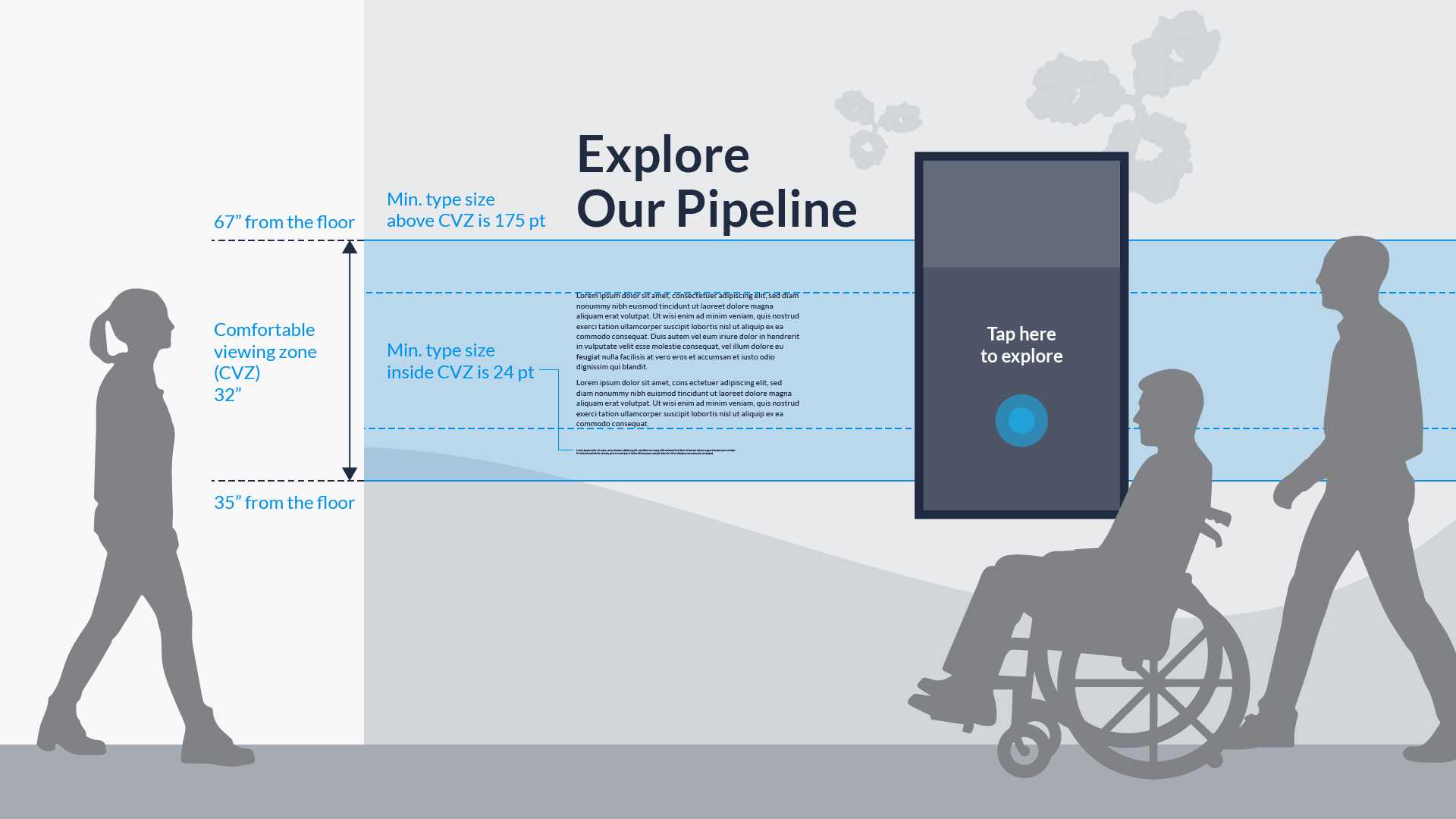
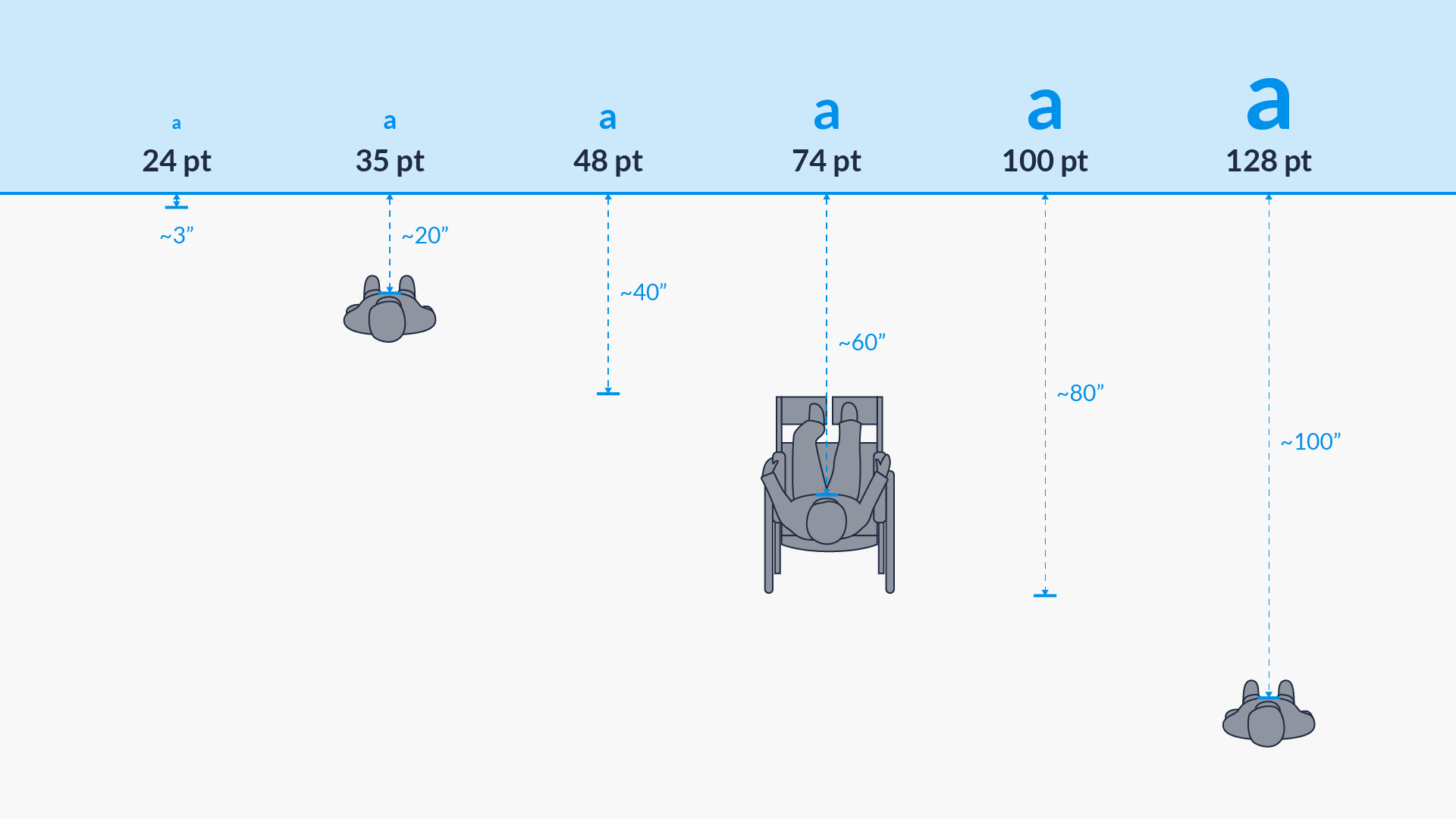
The CMHR Inclusive and Accessible Design Guidelines include a recommended Comfortable Viewing Zone or CVZ, that ensures visibility for viewers who are either standing or seated. Body text is displayed within the CVZ, which falls between 35” to 67” above the floor. The recommended minimum text size within the CVZ is 24 pt, and 175 pt for any text placed above the CVZ. We use a template with these measurements as a guide to inform our text and visual content layouts for scientific conference booths.
Pro tip:
- Place key or important content within the CVZ and at a legible text size for easy reading for both standing and seated audiences
Pro tip:
- Ensure screen height, and interactive elements within the screen, are accessible for wheelchair users
- Work with partner vendors to align on monitor placement, then design accordingly
Type Legibility in Accessible Design for Scientific Congresses
Readability is the measure of how easily a reader engages with and understands written text. But for something to be easy to read, it also has to be legible. Legibility is the measure of how easily a reader can correctly identify characters and words. At scientific congress booths, poor typographic and formatting decisions can significantly impact legibility, reducing accessibility and therefore negatively impact engagement with your audience.
Type legibility, after CMHR’s Inclusive and Accessible Design Guidelines.
Not all typefaces are designed for legibility. And although there is no definitive answer for which typefaces are most accessible, the Smithsonian Guidelines for Accessible Publication Design recommend using slab serif or sans serif typefaces, as their character proportions most often meet requirements for accessible type. However, some serif fonts do display accessible characteristics like line thickness variation and larger openings or apertures, which are considered more legible. There are also typefaces that are designed specifically for those with visual or cognitive disabilities like Lexend and Atkinson Hyperlegible. In the end, testing and engaging with people can help evaluate how legible a typeface is.
Pro tip:
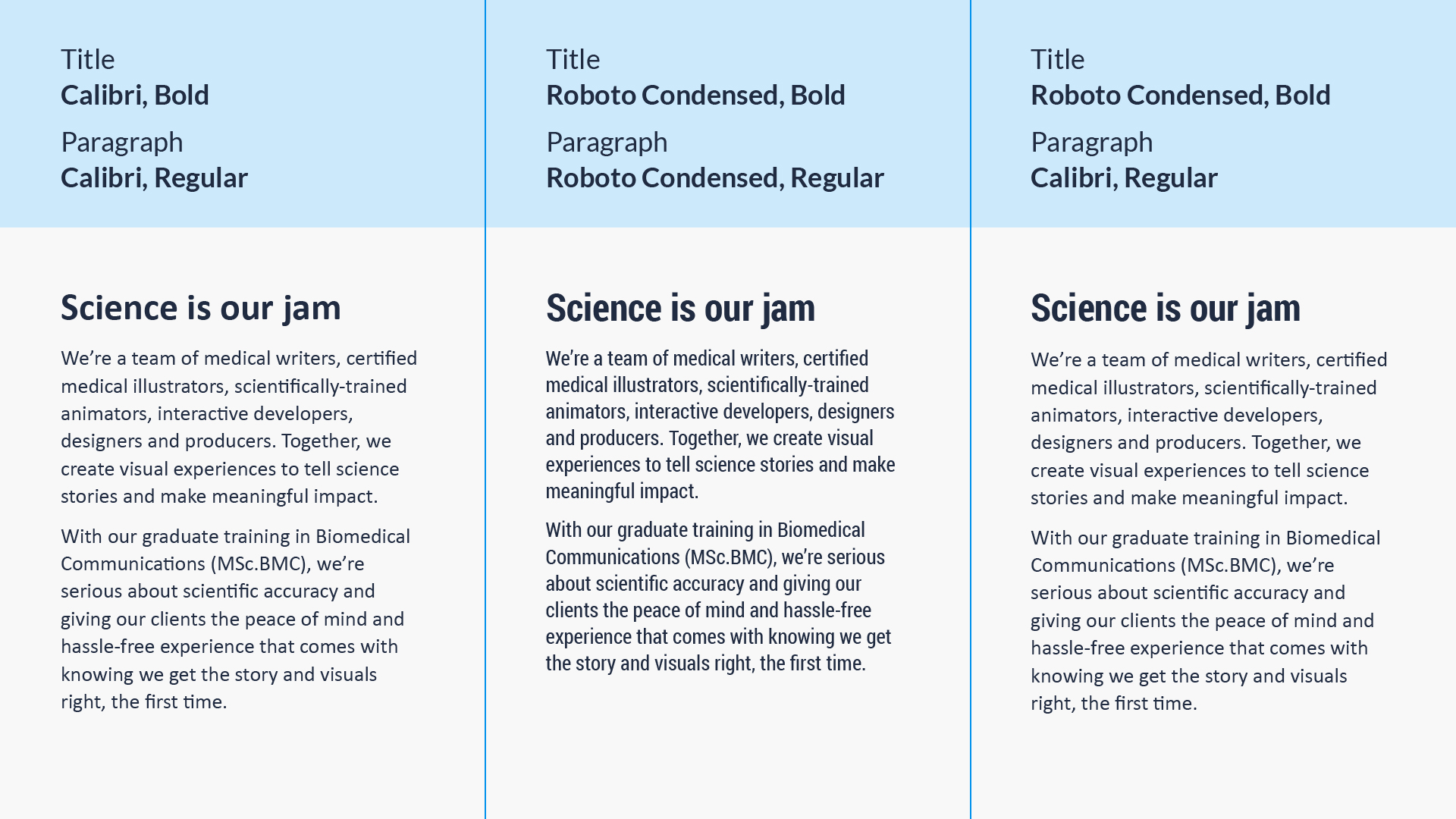
- Consider using sans serif typefaces for smaller text. Humanist sans serif typefaces like Calibri or Tahoma are generally designed for optimal legibility and readability
- Be careful when using extended and condensed typefaces for paragraph text as they distort character and word shapes. Consider limiting their use to larger headings
- Although some typefaces are designed for accessibility, testing is still recommended to optimize accessibility at your scientific congress booth
Pro tip:
- Use bold and italics in paragraph text wisely. Although great for emphasizing keywords, these styles can change the shape of words. In some typefaces, italics can often appear more decorative or lighter in font weight, making them harder to read
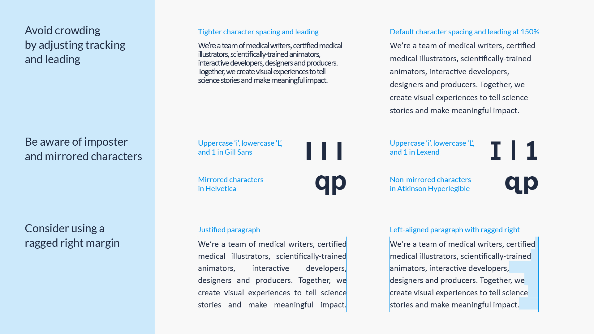
- Avoid text crowding. Characters or words that are too close together are less legible. Kern between specific characters or adjust the tracking of an entire paragraph
- Choose typefaces with recognizable characters. For example, imposter characters are when a letter is mistaken for another, like with capital ‘i’ or lowercase ‘L.’ Another example is mirrored characters like “db” or “qp.” Check to see if their shapes are distinct enough from each other as some readers may find it difficult to read words like “dog” and “bog”
- AVOID ALL CAPS IN PARAGRAPHS. Capital letters have a uniform rectangular shape which makes it harder for readers to identify words by their overall shape
- Check the spacing between lines of text—called “leading”. Most sources recommend a leading value of at least 120–150% of the point size
- Keep text lines short. Aim for a line length of 40–55 characters per line, with a minimum of 30 and a maximum of 70 characters, to avoid reader fatigue and enhance readability
- Left-align most of the time. When reading a paragraph, a ragged right margin—an irregular margin on the right side of the paragraph—is easier to read for audiences with low vision and/or cognitive disabilities. Avoid full justification as it not only removes the ragged right margin but also results in inconsistent spacing between characters and words
Determining type sizes is one of the trickier challenges in designing booth murals. We are often faced with putting a lot of content on limited wall space in scientific conference booths—a challenge for accessibility. The CMHR’s guidelines provide minimum type sizes based on viewing distance for museum visitors who are in either standing or seated positions, such as those using wheelchairs.
Pro tip:
- Use at least the recommended minimum type size for important content
- Will there be physical obstacles—furniture or objects—between your audience and the wall that will prevent them from getting close? If so, go bigger than the minimum type size
Visual Contrast Improves Clarity in Scientific Congress Booth Displays
Contrast plays an important role in visual perception and is therefore a key consideration when designing accessible experiences for scientific congress booths. When people have trouble seeing, it may be because the visual itself has insufficient contrast or the viewer has insufficient sensitivity to contrast as a result of a visual disorder.
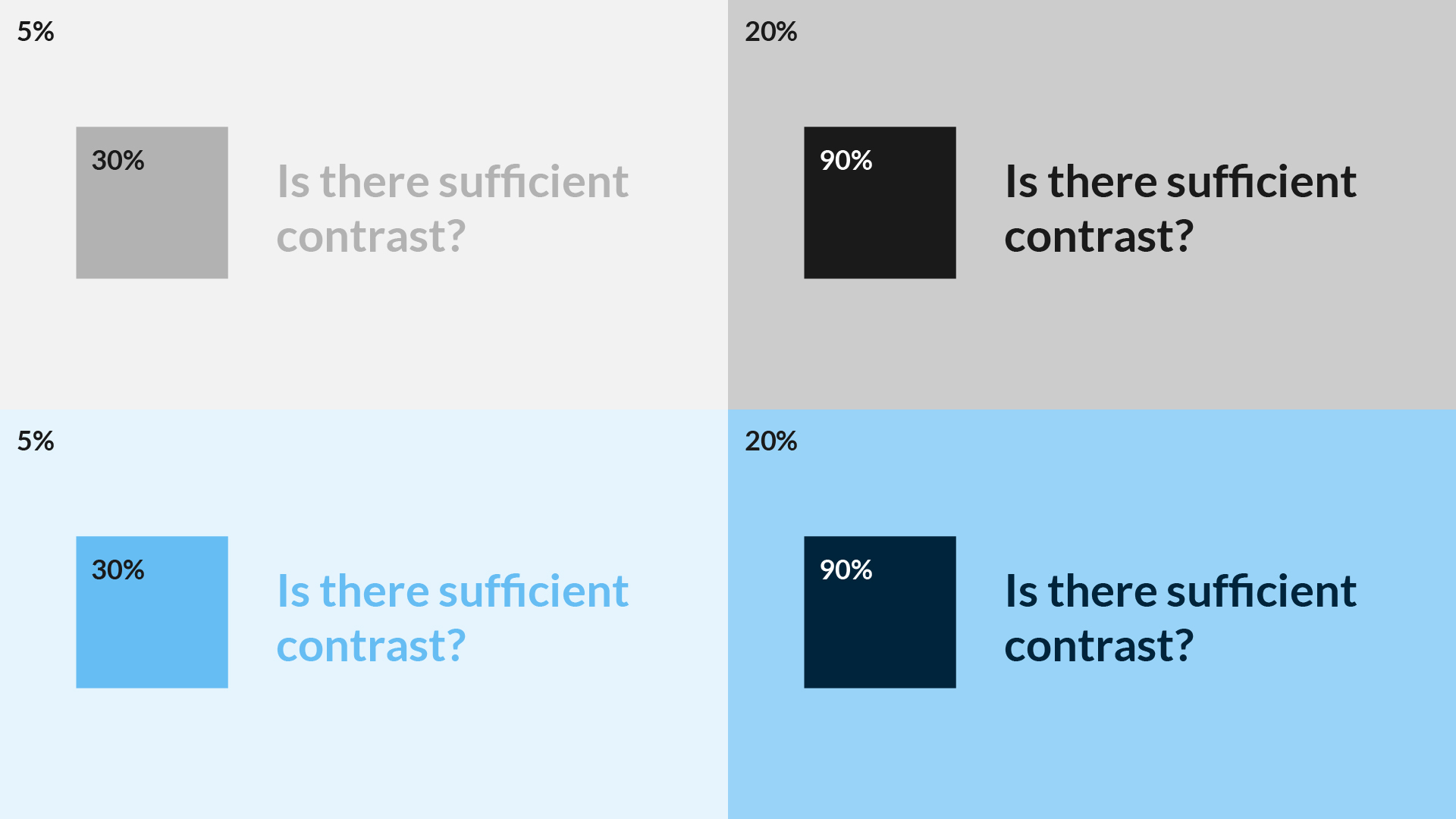
Lightness corresponds to how much light appears to be reflected from a colored surface. In color theory, lightness also corresponds to the amount of white or black mixed with a color. Adding white makes the color lighter (creating tints) and adding black makes it darker (creating shades). The greater the difference in lightness between elements, the greater the contrast between them.
Pro tip:
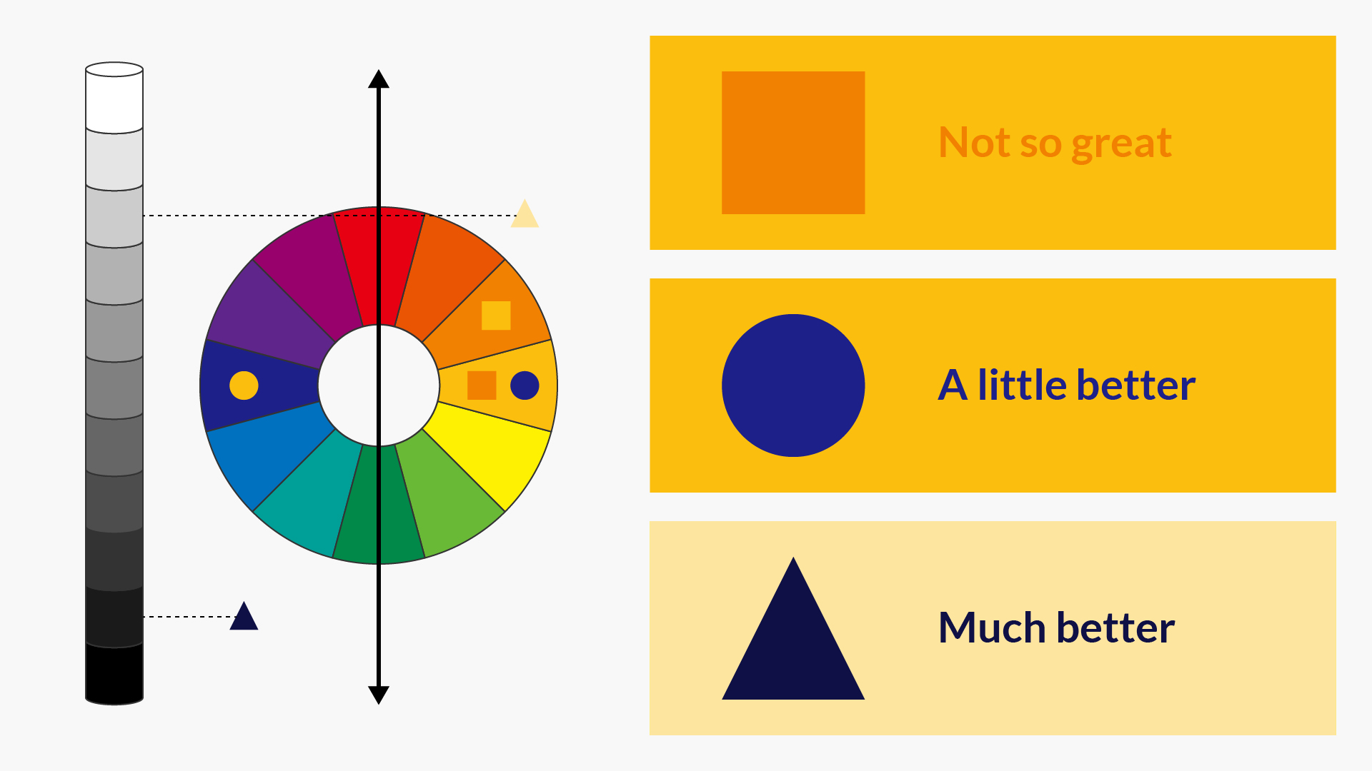
- Exaggerate lightness differences between foreground and background elements. For example, ensure there is at least 70% contrast between text and background
Hue or color is defined as red, green, blue, etc., and is determined by the wavelength of light being reflected or produced. Saturation is the degree of hue intensity or dominance. 100% saturation means there is no addition of gray to the hue, so saturated colors appear more vivid while desaturated colors appear more dull. When a person has color vision deficiencies, their ability to discern different hues alone or on the basis of saturation is lessened.
Pro tip:
- Be careful when using hues that are adjacent to each other on the color wheel if you’re aiming to create contrast between foreground or background elements (e.g. orange text on a yellow background)
- Even when using opposite hues on the color wheel, contrast and legibility is not guaranteed. Consider the lightness and saturation properties of the hue as well to increase visual accessibility
- Avoid using color alone to convey important information. Consider using text, icons, or other visual elements to reinforce clear communication
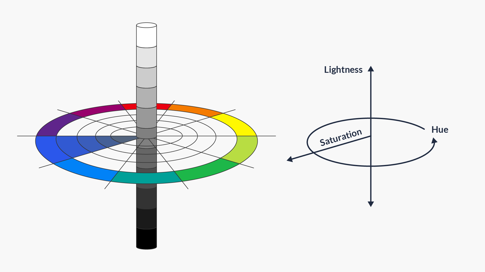
After the Munsell Color System. Hue is represented in the color wheel; lightness is measured vertically along the y axis; and saturation is measured radially outward from the y axis.
Other Ways to Improve Access at Your Scientific Conference Booth
Provide multiple ways to access information
Sometimes we encounter design challenges that make it difficult to adhere to accessibility standards at scientific congress exhibits. For example: when there is not enough wall space to fit all of the important text within the CVZ. When this happens, providing an additional way to access information at your scientific congress booth can help. For example, you can provide print collateral like brochures that include the same information as the mural, or a quick-response (QR) code to a website or downloadable PDF that audiences can access on their own devices.
Pro tip:
Keep in mind that QR codes are only helpful if the user has access to the internet. There are also minimum QR code sizes that take into account the user’s scanning distance. The farther away the scanning takes place, the larger the QR code needs to be. A rule of thumb is to use the scanning distance to size ratio of close to 10:1. So if the QR code is 10” away from the user, then the code should be 1“ big. In addition to adding a call-to-action next to your QR code, make sure to test the scannability of it using different devices.
Test your scientific exhibit designs for accessibility before launch
Scheduling time to test our design solutions and challenge assumptions goes a long way toward delivering engaging user experiences at scientific conferences. Text legibility can be tested by projecting a mural at scale to identify areas that are hard to see or read, or printing test proofs at scale to identify areas that lack contrast in different lighting conditions; and lighting conditions can be quite variable from one scientific congress booth setting to the next. We also test the heights of shelves and multimedia content to determine how accessible these are from both standing and seated positions.
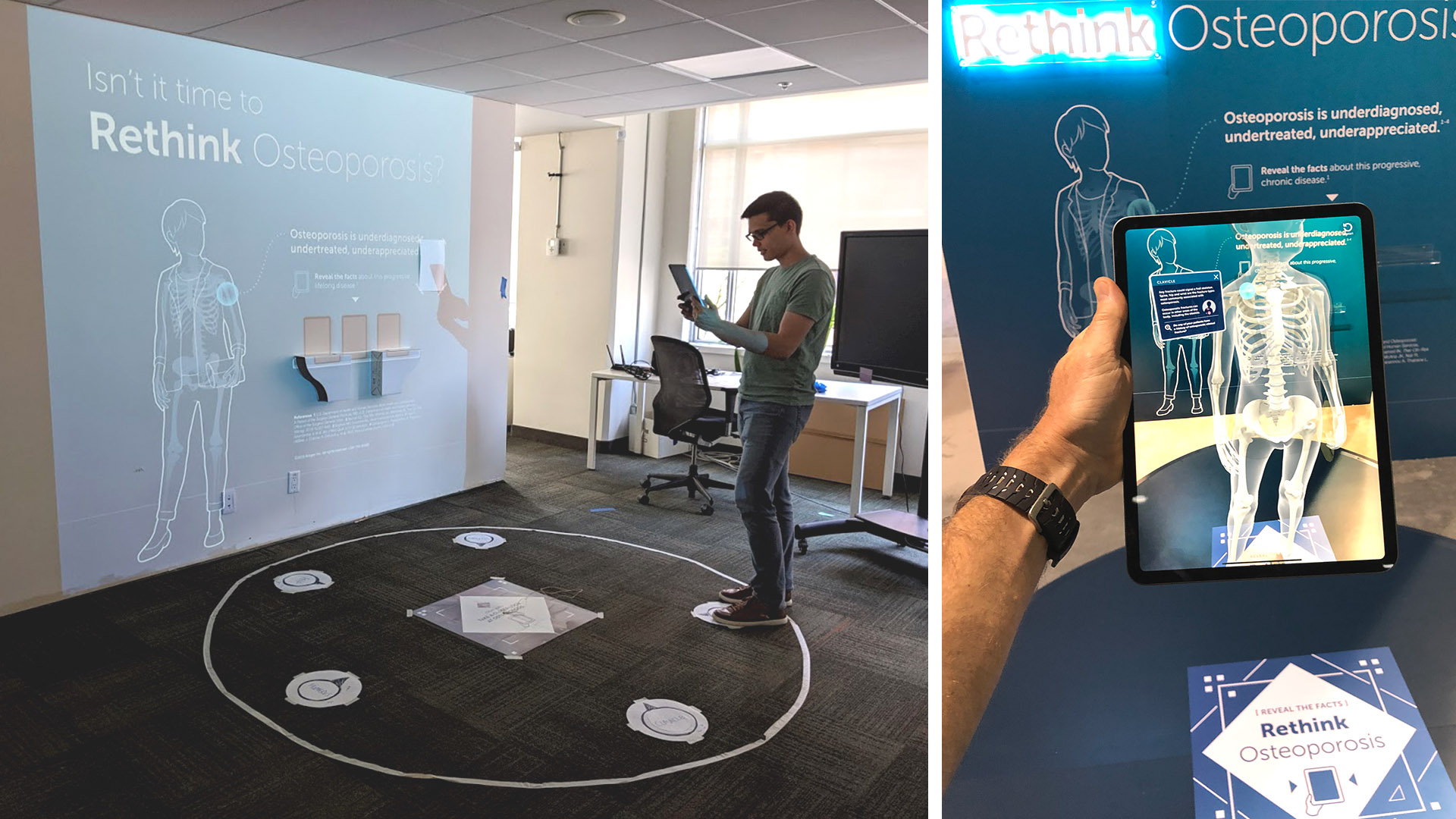
Prototyping a spatial experience not only makes your design tangible but also allows for testing with a real audience. To ensure your design meets the needs of your target audience, recruit testers who reflect that audience. But when working with your target audience is not possible, you can still run informal tests by recruiting coworkers who are not part of the project team and are unaware of your client’s and team’s intentions. In the test pictured below, we evaluated the mural along with an Educational AR experience. Testers helped us identify that the intended iPad model may be too heavy for users carrying bags or beverages (which attendees often do in scientific conference settings).
Collaborate with partner booth and AV vendors
Lastly, a thoughtful and well-designed spatial experience requires close collaboration between several teams. Working with partner vendors, we align on structural details like monitor height or kiosk placement and visual considerations like matte finishes that reduce glare on printed graphics. Open communication among partner vendors is important to ensure print graphics and interactive experiences are properly tested for technical or legibility issues well in advance of their deployment at scientific congresses.
Concluding Thoughts on Designing Scientific Congress Exhibits for Accessibility
Scientific congress booth. Videos and graphic design by AXS Studio. Booth design and build by Czarnowski. Technology by D&J Electronics. Photograph by Kathryn Rapier.
We are, of course, just scratching the surface with our procedures for ensuring accessibility at scientific conference booths. Eventually, our goal is to continuously evaluate our procedures to also cover inclusive design principles to enhance narrative and learning experiences for all.
Designing for all audiences, regardless of their abilities, makes communication and learning possible. Accessible design makes sure your booth, brand, and message don’t go unnoticed, unlocking the potential of your scientific and medical content. We hope that by sharing our experiences and lessons learned, this blog post series will start conversations around accessibility, and contribute to workflows and procedures to lower barriers to understanding science.
Ready to take your scientific booth murals and interactive experiences to the next level? Get in touch!
Helpful Resources for Accessible Design at Scientific Meetings
- Smithsonian Guidelines for Accessible Exhibition Design (link)
- Smithsonian Guidelines for Accessible Publication Design (link)
- Accessibility Services Canada: Ingenium Accessibility Standards for Exhibitions (link)
- Canadian Museum for Human Rights Inclusive and Accessible Design Guidelines (link)
- Material.io: Accessible Design (link)
- Google Fonts: Readability and accessibility (link)
- Institute for Human-Centered Design: Resources (link)
One Response
hi