Medical Affairs and Science Communications professionals are tasked with distilling medical research and scientific information into engaging and informative stories. These are often made for a variety of audiences, including healthcare providers and patients. Animation is well suited to visualizing dynamic and abstract processes. Take for example, the pathophysiology of a disease at the cellular scale, or the binding of drug molecules to target receptors in a diseased cell. The past two decades, 3D computer animation revolutionized the communication of medical and scientific processes like these. Nonetheless, the world’s best medical animation is useless unless it is accessible to its intended audience. Meeting the needs of audiences with different abilities and viewing preferences is essential.
How Accessibility in Medical Animation Helps Everyone
Publishing or sharing scientific information comes with both a legal and ethical responsibility to ensure it is available to all, including those with disabilities. When the Americans with Disabilities Act (ADA) was enacted in 1990, accessibility features such as closed captioning became mainstream. It enabled those who are deaf or hard of hearing to have access to video content they weren’t able to enjoy before. It’s worth noting that captions and transcripts are also used by people without disabilities in a variety of situations. Closed captions are useful if you are showing a medical animation in a loud environment (e.g. a conference exhibit hall), when people can’t turn on sound (e.g. in a library), or when people understand written language better than spoken. People can skim through video transcripts before committing to watching a video. The transcript of a medical animation can be read instead of streaming a video to save data on mobile devices. So, although accessible media is essential for people with disabilities, it benefits and improves everyday life for all.
How Accessibility Benefits Businesses that Commission Medical Animation
Incorporating accessibility features in video can also contribute to the profitability of businesses and other organizations. For websites especially, making audio and video content accessible results in better indexing by search engines, as well as increased traffic and use by a wider range of audiences. Designing medical and scientific animations to be accessible to everyone not only enhances a brand’s reputation but also improves audience satisfaction by providing equal opportunities for learning and engagement.
One of our goals at AXS Studio is to identify barriers to understanding science—and finding ways to reduce them for audiences, regardless of ability, age, or background. Through our experiences, we have identified the need to develop an iterative and evolving process of evaluation to address these barriers so that our clients’ messages reach as many people as possible.
Scientific animation displayed in a congress booth. © 2019 Seagen.
Below is a list of handy accessibility tips we’ve developed from our experiences creating medical and scientific animations. These topics are part of an iterative and always evolving evaluation procedure for making accessible content. We hope these are useful for your own scientific communication project workflows.
If you missed Part One of our Accessibility in Scientific Communications series dealing, you can catch up here.
Tips for Designing Accessible Medical and Scientific Animations
When designing animations for accessibility, we strive to create informative and engaging content that can reach target audiences regardless of abilities or viewing preferences. A key resource is the Web Content Accessibility Guidelines (WCAG) by the World Wide Web Consortium (W3C) Web Accessibility Initiative (WAI). These technical documents explain how to make web content (like audio and video) more accessible to people with disabilities. The WCAG has three levels of web compliance: A, AA, and AAA. Level A is the minimum level, meaning your video is at least 80% compliant. Level A criteria include video captions and non-text content alternatives. We also consult recommendations from the Smithsonian Guidelines for Inclusive and Accessible Design and Accessibility Services Canada.
Considerations for Accessible Audio Content in Medical Animations
Background audio that doesn’t distract
- Use low background music and sound effects. Set levels so people with hearing or cognitive disabilities can easily distinguish the voiceover from the background audio. WCAG recommends setting background sounds to at least 20 decibels lower than the voiceover.
- Avoid sounds that can be distracting or irritating, such as high pitches and repeating patterns
Speech that is easy to follow
- Medical and Scientific animation often uses complex and/or unfamiliar terms. Ensure your narrator speaks clearly and slowly to enable people to understand better.
- A slower speaking pace makes the timing better for captions and sign language
- Pause between topics to allow people time to process information
Accessible storytelling and language in medical animation
- Be mindful of using metaphors, jargon, acronyms, and idioms as certain expressions may be unfamiliar or interpreted literally by audiences. Strive to use plain language and avoid jargon throughout medical animations. If you must use jargon, find a way to explain it within the story.
- Is your target audience PhD scientists, family physicians, or patients? Consider your audience’s reading level to ensure on-screen text and narration in the medical animation are accessible and understandable. Some useful patient or plain language communication resources you can refer to are:
- CDC: Everyday Words for Public Health Communication (link)
- CDC: Plain Language Materials and Resources (link)
- The Federal Plain Language Guidelines (link)
- Plain Language at NIH (link)
- The Patient Education Materials Assessment Tool (PEMAT) and User’s Guide (link)
- SMOG (Simple Measure of Gobbledygook) Readability Calculator (link)
Considerations for Accessible Medical Animation Video Content
Readable on-screen text
Legibility and readability are key considerations for accessibility medical and scientific animation, regardless of the audience’s abilities. However, for people with disabilities, readable on-screen text in videos is essential for a successful and meaningful experience. For optimal legibility, there are several typeface features to consider: please refer to Type Legibility in Part One of our Accessibility in Scientific Communications series.
Pro tips:
- Consider using a sans serif typeface for smaller text like labels or disclaimers
- Be careful when using extended and condensed typefaces for small text, as they distort character and word shapes. Consider limiting their use to larger text and titles
- Avoid text crowding. Characters or words that are too close together are less legible
- Check the spacing between lines of text—called “leading”. Most sources recommend a leading value of at least 120–150% of the point size
- Sometimes it’s difficult to distinguish on-screen text from the animated scientific content in the background. Consider using color and graphic elements to separate text from background
The display duration and placement of on-screen text are also important for readability. Text should be displayed long enough for a viewer to comfortably read and process the information. Strategically position on-screen text so it doesn’t obstruct but rather supports visual elements in the medical animation. In general, keep on-screen text clear and concise for easy reading, without detracting from the other animated elements.
Captions and subtitles are another type of on-screen text relevant to accessibility in medical and scientific animation. They will be covered later in this article.
Use video safe zones to ensure visibility throughout your medical animations
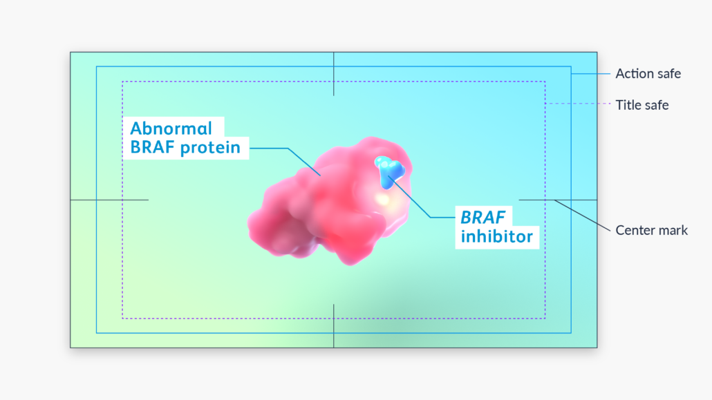
Video safe zones are designated areas where important content and elements like on-screen text and graphics remain visible to viewers. Safe zones were first implemented back when manufacturing differences between televisions resulted in the image being cropped at the edges. Even now with HD and 4K televisions and monitors, most models have overscan, which results in video edges being cropped.
Another accessibility consideration is how your medical animation appears on different devices. Most devices have the ability to display a video full screen. However, this may crop the top and bottom of a video, since not all mobile devices have a 16:9 aspect ratio.
The best practice for 16:9 video is to place all critical information within the action- or title-safe areas. Most video editing software like Adobe After Effects or Premiere Pro have these safe areas available as a guide. Different ad or social media platforms (TikTok, Instagram, etc.) have their own video safe zones to keep in mind.
Action and title safe zones as guides for keeping critical visual information visible.
Pro tip: Start using the title-safe zone for labels during the storyboard stage. This will help the animation team plan shot layouts to accommodate on-screen text. It will also give reviewers a more accurate picture of how the final animation shots will look early in production.
Use visual contrast in medical animations for clarity
Hues are perceived differently by people with color vision deficiencies. This results in a different perception of colors and relative luminance contrast (contrast ratio) than for normally sighted viewers. Because of this, good luminance contrast is required to make medical and scientific animation accessible to those with deficiencies in color vision. According to the WCAG, the visual presentation of text should follow Level AA compliance at minimum. This means having a contrast ratio of at least 4.5:1. There are some exceptions to this requirement:
- Large-scale text (at least 18 pt or 24 px and above) can have a contrast ratio of 3:1 or more
- Text that is part of a logo or brand name has no contrast requirement
For a deeper dive into luminance and contrast, you can refer to this great developer resource article from Mozilla. And here are some handy contrast checker and color blindness tools available online:
Other considerations for accessible video in medical animation
- Avoid anything that flashes or flickers more than 3 times in a one second period. This ensures that the video is safe for people with photo sensitivities, autism, ADHD, or recovering from concussion
- If your video has a visible speaker/narrator, consider their visibility on the screen. Some viewers rely on mouth movement to help understand spoken language
Captioning Improves Medical Animation Video Accessibility
The difference between captions and subtitles
Captions and subtitles are text transcriptions of the speech and non-speech audio information (e.g. sound effects and music cues). They are both used by people to understand medical animation content but are technically different from one another:
- Captions are used for the same language as the spoken audio
- Subtitles are used for spoken audio translated into another language
Both forms are implemented the same way: displayed within a video player and synchronized with the audio. Both forms may also include non-speech audio information such as music cues and sound effects. However, captions are required for accessibility, whereas subtitles are not directly an accessibility accommodation.
Note: In some regions of the world, the terms caption and subtitle are used interchangeably. Subtitles may be used for both the same language as the audio and for the translation: intralingual subtitles (same language) and interlingual subtitles (different language).
The difference between open and closed captions
Captions transcribe dialogue and can also contain information like audio and musical cues. They’re designed for use by the d/Deaf communities and those with hearing impairments. Captions are also used to meet ADA compliance requirements. There are two types of captions:
- Open captions cannot be turned off and are pre-rendered or “burned” into the medical animation file itself. Open captions are not ideal since they’re not accessible for screen readers. Nor can audiences use translation tools, change the font size, or customize the text in other ways. However, pre-rendered or open captions are useful on platforms that do not support alternatives. For instance, monitors or screens that don’t support interactivity.
- Closed captions can be turned on or off by the viewer using a web video player interface to watch medical or scientific animation. Closed captions require a caption file (e.g. .VTT, .SRT) that accompanies the video.
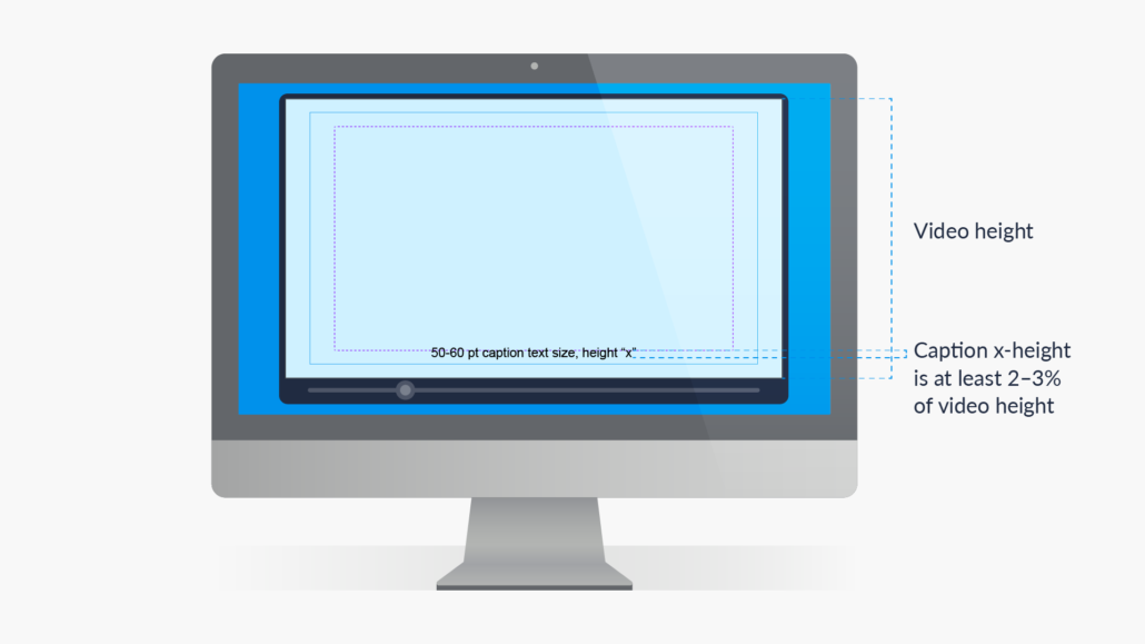
Recommended caption text size and placement.
Pro tips:
- Caption position:
- Aim to keep caption text within the action-safe zone in your medical animation
- Aim to keep y-axis position and alignment consistent throughout the video. E.g., if the first caption is center-aligned, use that alignment for the entire video. Nonetheless, captions can have various placements, depending on speaker location or video design
- Caption text size:
- We recommended a caption text size with an x-height that is 2.5–3% of the video height in pixels. We calculated this using Max Deryagin’s Subtitling Studio. For example, a video height of 1080px corresponds to 50-60 pt for optimum legibility. It is important to note that some web video players allow audiences to change the size and formatting of captions.
- Caption line length and timing:
- Use a number range of 30–42 characters per line (or CPL)
- Avoid having 3 or more caption lines
- Break lines at natural or logical points in the medical animation script
- Use ~0.3 seconds per word or 1 second per line. Timing is ultimately an editorial decision that depends on the rate of speech, text editing and shot synchronization
Creating closed captions or subtitles for medical animations on the web
The most common format for captions on the web is WebVTT (Web Video Text Tracks Format). A .vtt file is widely supported, and is a human-readable file format that can be edited in any text-editing software. For example, MS Word and Notepad. The text file stores captions sequentially along with timing information. You can generate a .vtt file from scratch or use an online editor like YouTube Studio or Happy Scribe. These online editors have features that allow you to edit captions in real time with the video. They also let you easily manage characters per second (CPS) and CPL.
Transcripts and Sign Language to Improve Medical Animation Accessibility
Transcripts for those who have difficulty processing auditory information
A basic transcript is a text version of speech and non-speech audio information. Sometimes, transcripts include descriptions of the visual information needed to understand medical animation content. This is especially helpful for viewers who are both deaf and blind.
Planning for sign language overlays in your medical animation
If you plan to provide sign language, convention has the sign-language overlay in the bottom right corner of the video. Careful planning at the animation storyboarding stage will ensure that no important information is obstructed by the overlay.
Formatting Video for Medical Animation Viewed on Different Devices
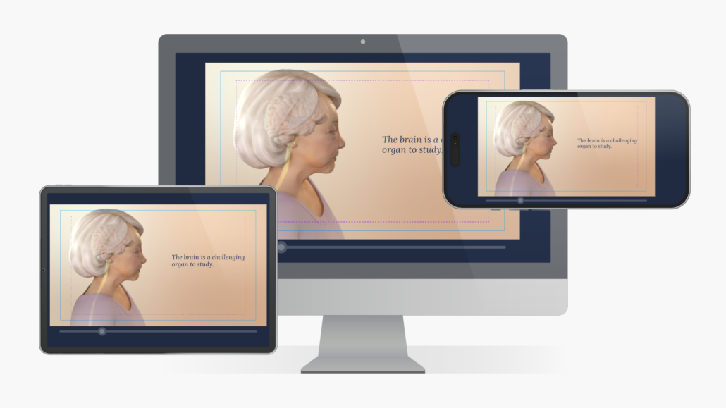
Multi-device testing of a medical animation intended for the web.
Most medical animators do their work using desktop monitors. It’s important to check the legibility of text and other visual elements on the different devices that people may use to view the end product. A label that looks clear on a 55-inch conference screen may be all but invisible to a person on their smartphone. As mentioned above, some devices crop parts of the video when in full-screen mode, which could hide important information. The only way to be sure your medical or scientific animation is accessible on all devices is to test it.
Pro tip: Don’t wait until late in production to test a medical animation on different devices. Changing the size or position of on-screen text can be problematic if done after a previous version has been approved by reviewers. Validating the size and placement of text and other elements on different devices early is simply smart design.
Web considerations for medical animation
A great deal of medical and scientific animation is created for online viewing – think medical affairs websites and drug MOA web pages geared to healthcare providers. There are also disease education and “what-to-expect” videos designed for patients.
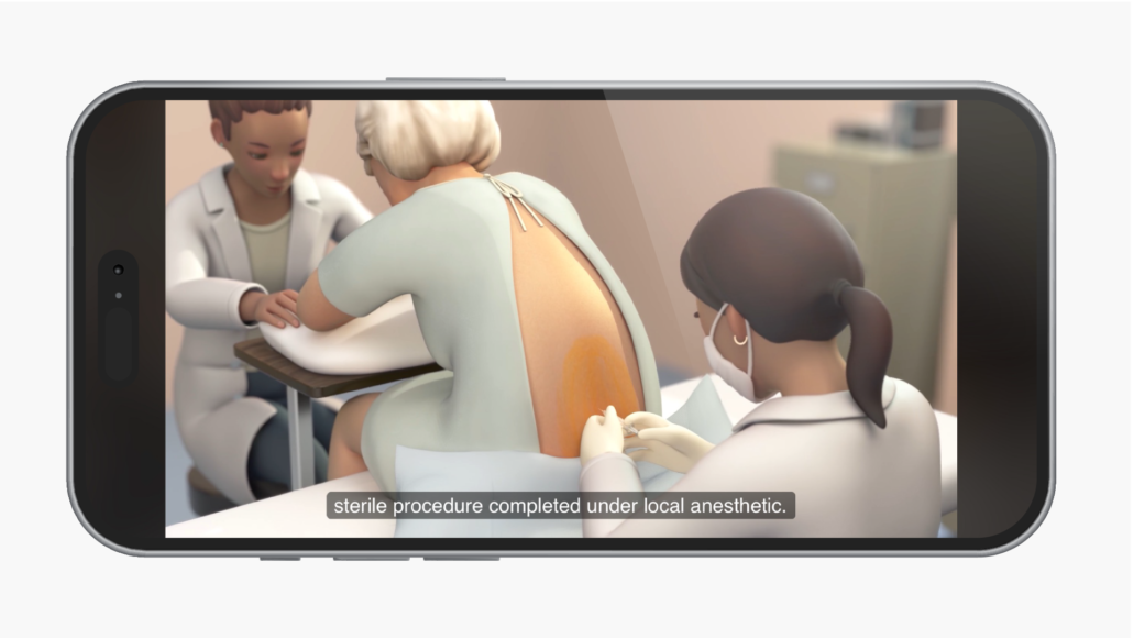
Medical animation formatted for viewing on multiple devices with captions.
Here are some points to consider specific to web video accessibility:
- Allow the viewer to start the video, rather than starting automatically, if the option is available
- Test the video on different devices, especially for mobile viewing, to assess:
- On-screen text and caption legibility
- Clarity of visual elements
- Playback performance. Use a video compression format optimized for streaming. H.264 (also called MPEG-4 Part 1) is the most widely used compression standard for streaming video. It provides high quality at a low file size.
- Popular video streaming services like YouTube and Vimeo have built-in video players. If you’re selecting a different video player to embed in a website, make sure its controls are accessible by assessing:
- Button sizes
- Available features such as:
- Scrubbing/playback controls
- Speed controls
- Volume control
- Fullscreen capabilities
- Captions (and display settings)
- Transcript
- Keyboard support for those using screen readers such as JAWS for Windows and Apple Voiceover
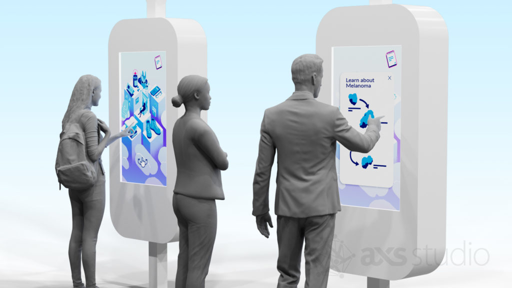
Scientific animation displayed on a congress touchscreen that allows for video player interaction.
Considerations for medical animation accessibility at congress booths
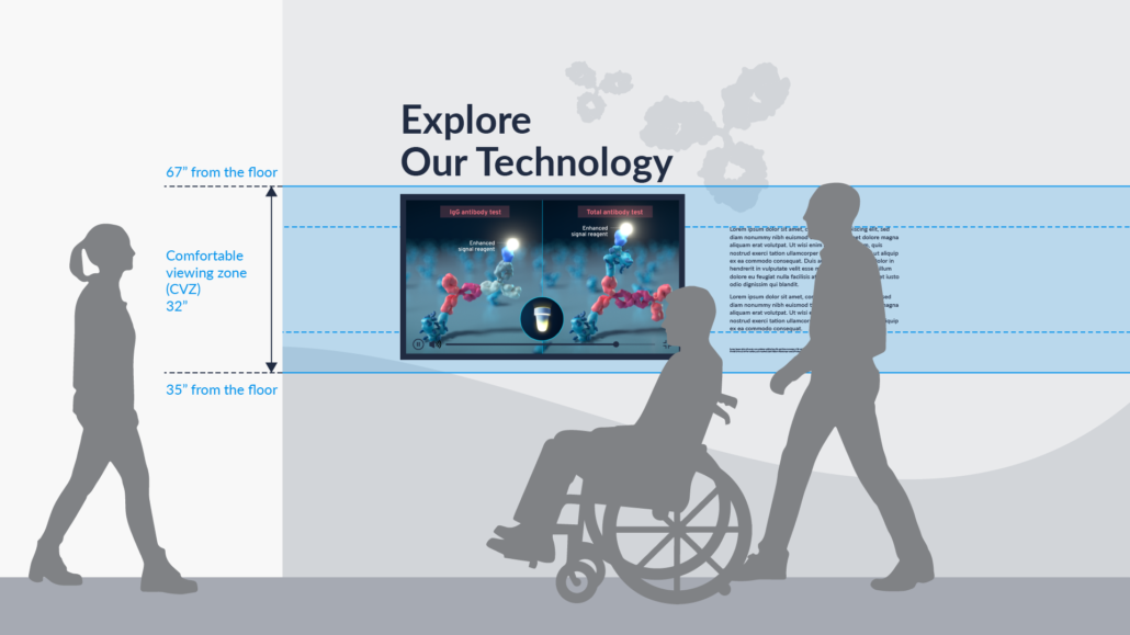
Showing video in a scientific conference booth presents specific challenges. The video monitor is usually mounted at one height for all viewers, regardless of their height. Medical and scientific conferences are typically noisy places, making it difficult to hear the audio. Also, AV equipment on site is often different that what is used during video review and testing. Here are some things to consider:
- Test the medical animation for legibility on a monitor of the same size and placement (height) that will be used in the booth. The monitor should be centered in the comfortable viewing zone (CVZ).
- If the booth monitor allows for interactivity, ensure that users can access video player features such as captions and pause/playback controls.
- Will audio come through loud and clear in a noisy environment? An overhead sound dome can be used to focus the audio in a specific zone. However, this may present challenges for viewers of different heights, including those who use wheelchairs. Consider using captions to ensure the medical animation content is accessible to all.
Pro tips:
- Work with the AV vendor well before the conference to test video playback and legibility on the actual equipment that will be used on site
- Recruit volunteers to watch the video on a monitor of the same size and placement that will be used in the booth. Ask them to report any difficulties following the action or reading on-screen text.
Concluding Thoughts About Accessibility in Medical Animation
There are many things you can do to make your medical and scientific animations accessible to a wider audience. These include using plain language, reducing background audio, optimizing text legibility and using the CVZ. The benefits apply to all people, regardless of ability. By considering accessibility with each new video, we aim to continually improve access and understanding of medical science.
Ready to take your medical and scientific animations to the next level? Contact us today!
Helpful Resources for Accessible Design in Medical Animation
- W3.org: Making Audio and Video Media Accessible (link)
- Smithsonian Guidelines for Accessible Exhibition Design (link)
- Accessibility Services Canada: Ingenium Accessibility Standards for Exhibitions (link)
- MDN Web Docs: Web Accessibility: Understanding Colors and Luminance (link)
- Vimeo: Subtitles vs captions: A quick guide to video transcription (link)
- BBC: Subtitle Guidelines (link)


