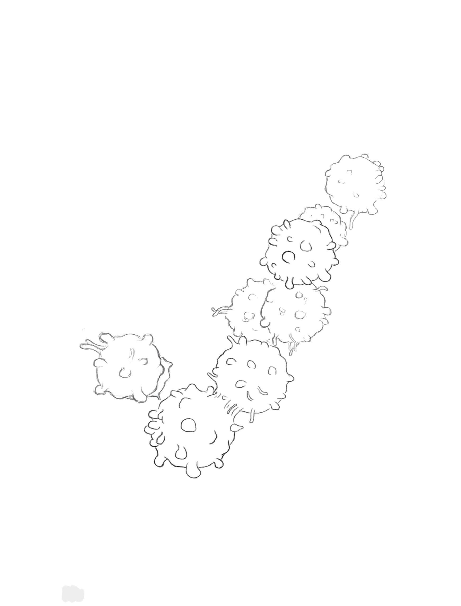
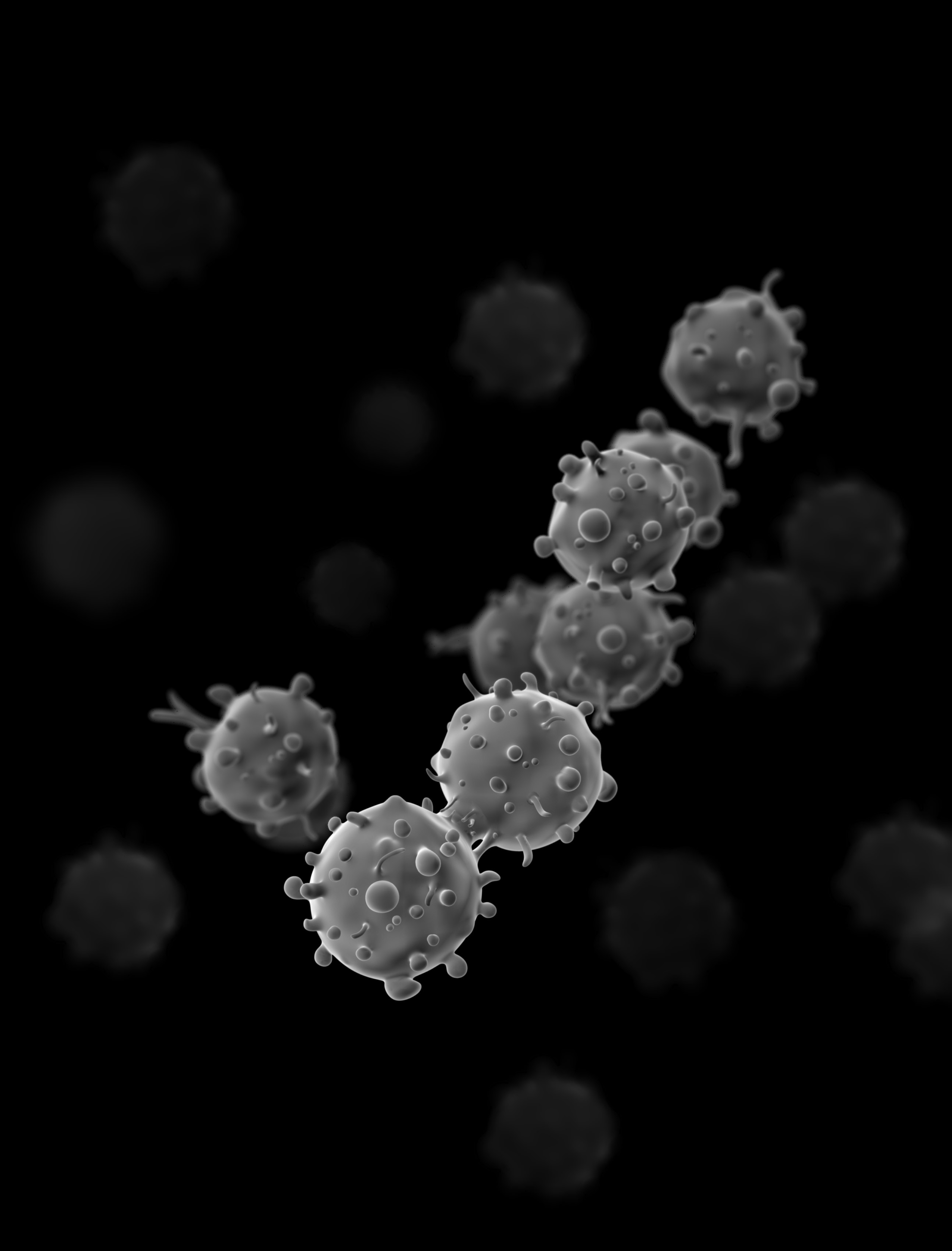
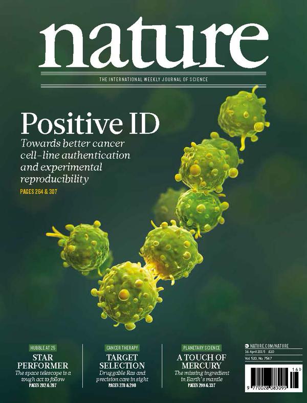
Following Nature Creative Director Kelly Krause’s vision, Susan depicted the story’s key idea — the importance of authenticating cell lines used in medical research — as a group of cells coming together in a check mark.
Through her research, she determined that cancer cell types were the most commonly contaminated lines, and then chose certain characteristics of cancer cells to emphasize in the illustration: irregular morphology and continuous cell division. Susan consulted dozens of visual references in order to depict the cells accurately and to create a scanning electron micrograph (SEM) look for the illustration.
The Sketch
As with all medical illustrations, Susan began with a sketch, which was approved by Krause. She then created 3D models, carefully building in the detail she wanted. Next came the application of colors, texture and lighting — all in keeping with Krause’s vision and color palette. The result: an engaging cover image with a high level of scientific accuracy.
Susan’s training and many years experience were essential to the demands of editorial illustration. “My science background and experience visualizing cell biology made it possible to do this piece quickly and get it right the first time,” Park says. “With editorial, you don’t get a second chance to get right,” she laughs.


