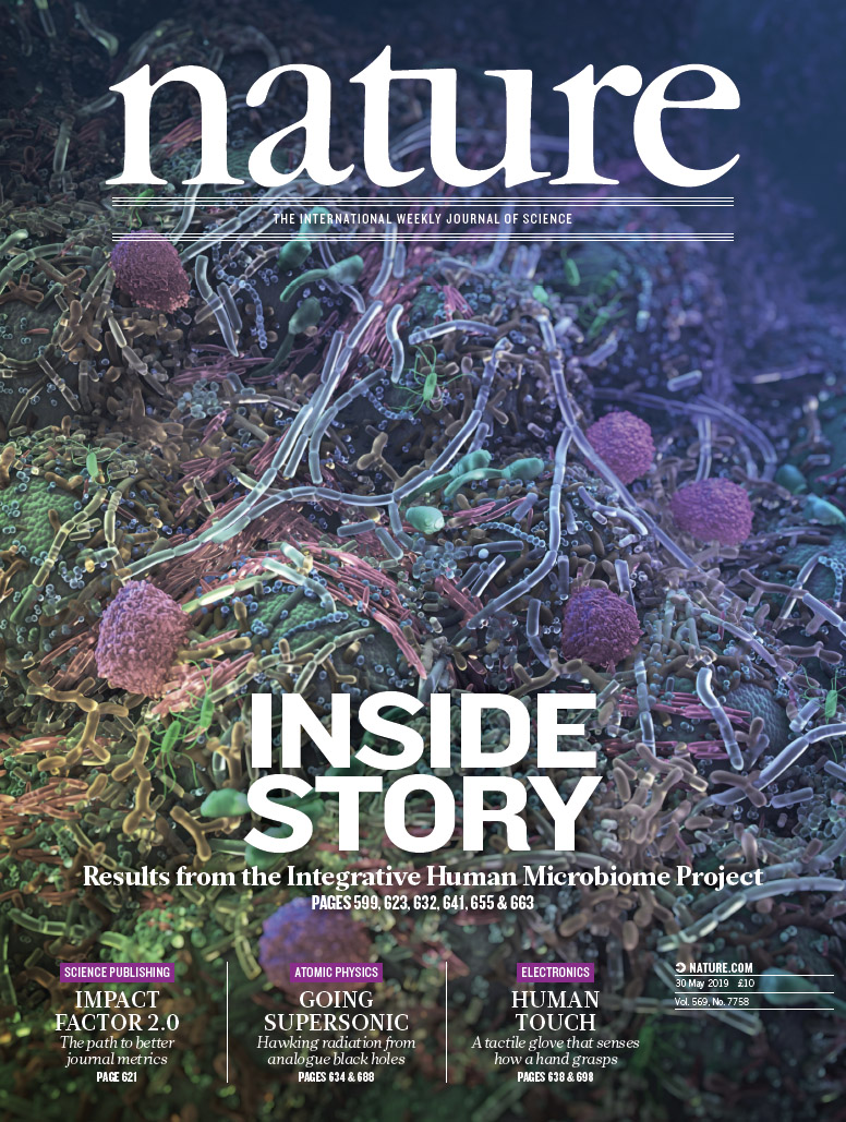
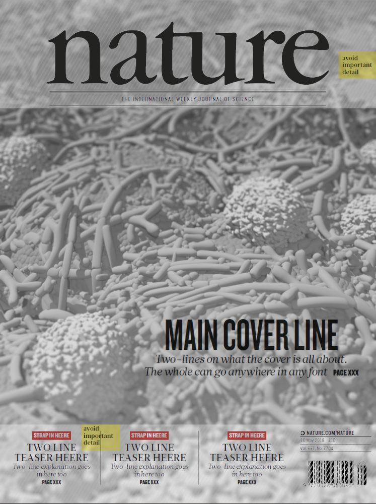
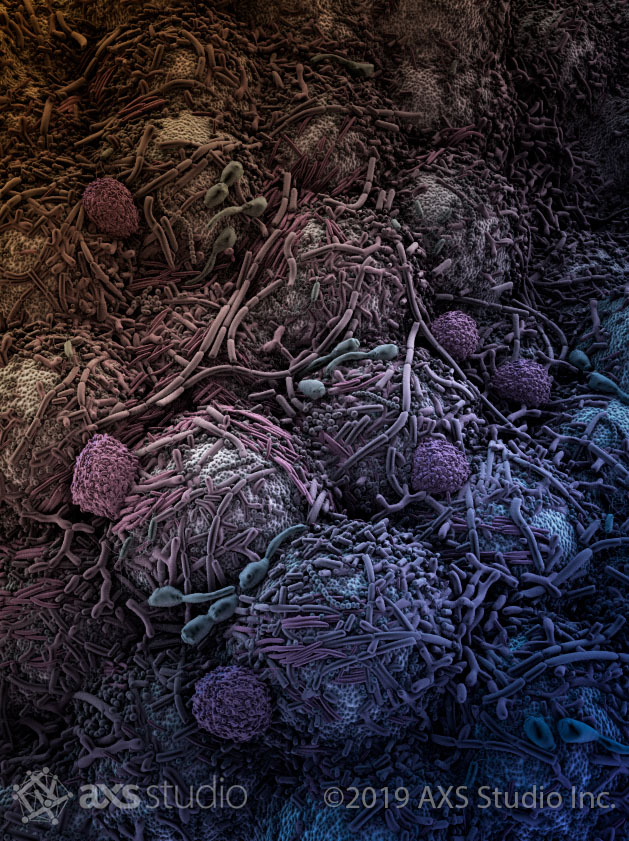
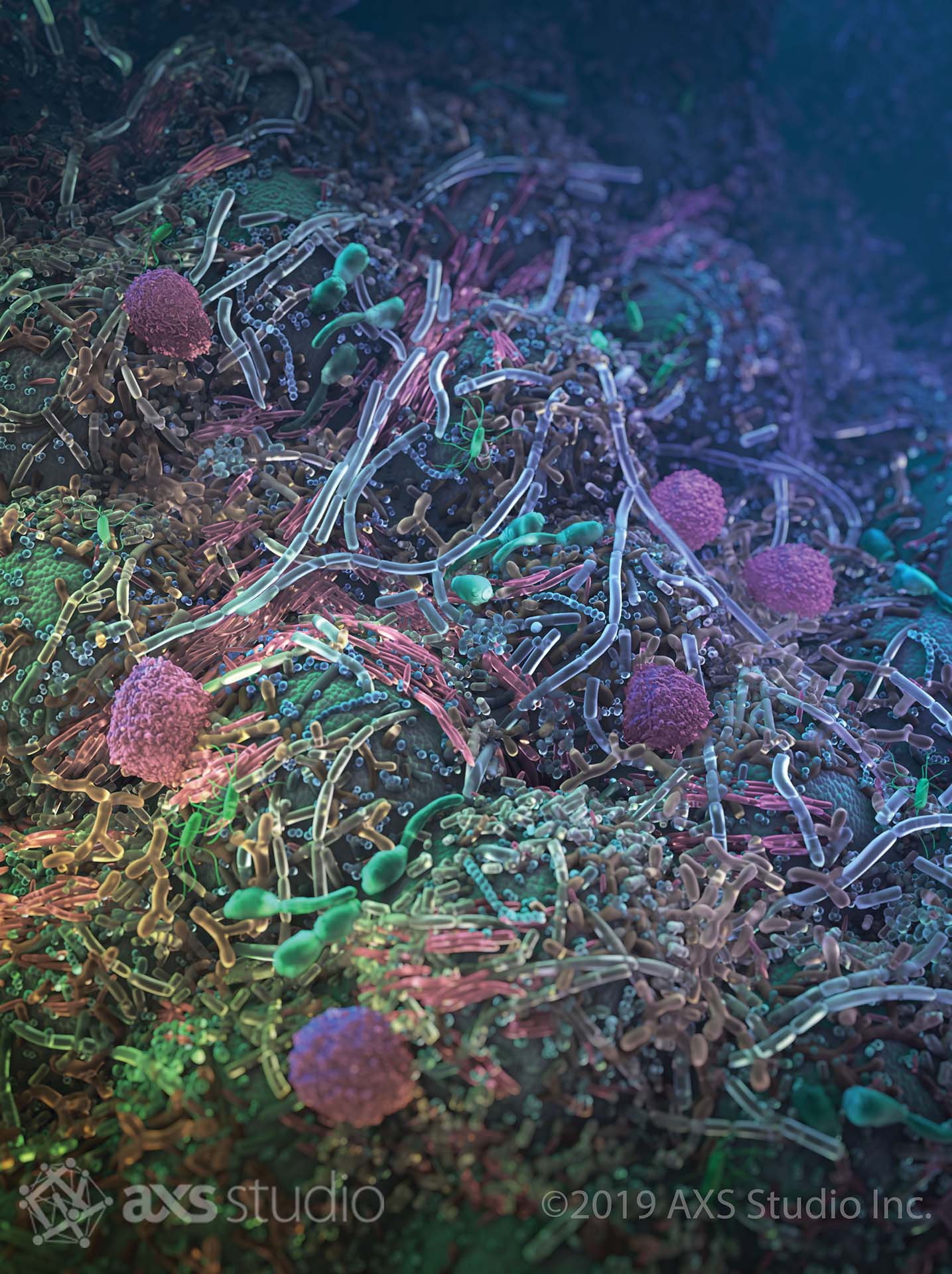
The Human Microbiome Project spanned 10 years and resulted in a foundational reference dataset for genomic diversity in human microbes, laying the groundwork for many studies to come. AXS Studio had the privilege of collaborating with Nature Creative Director, Kelly Krause to visualize this diversity in an eye-catching editorial cover for this important issue of Nature.
Nature Journal Cover
The human microbiome is our friend—mostly
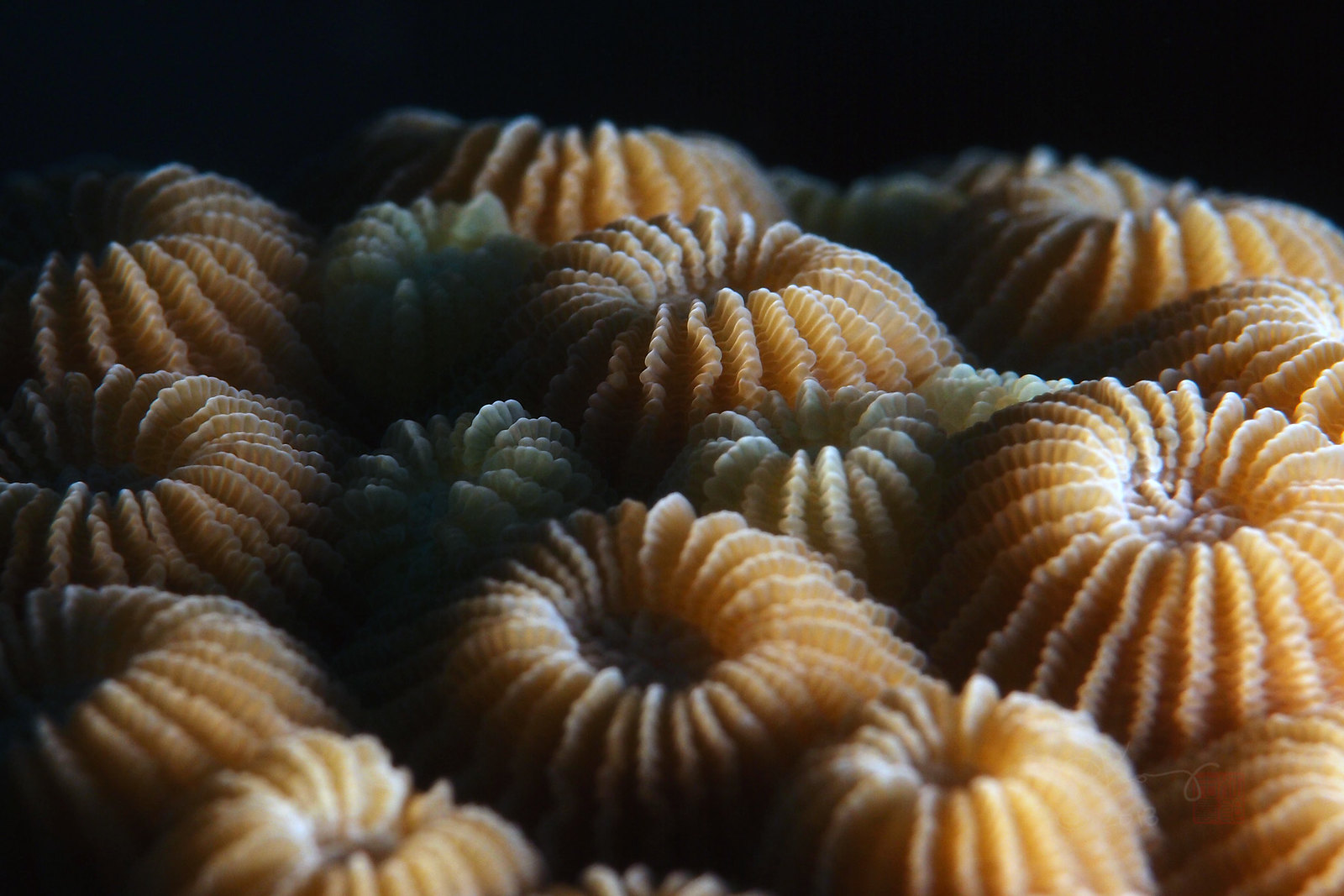
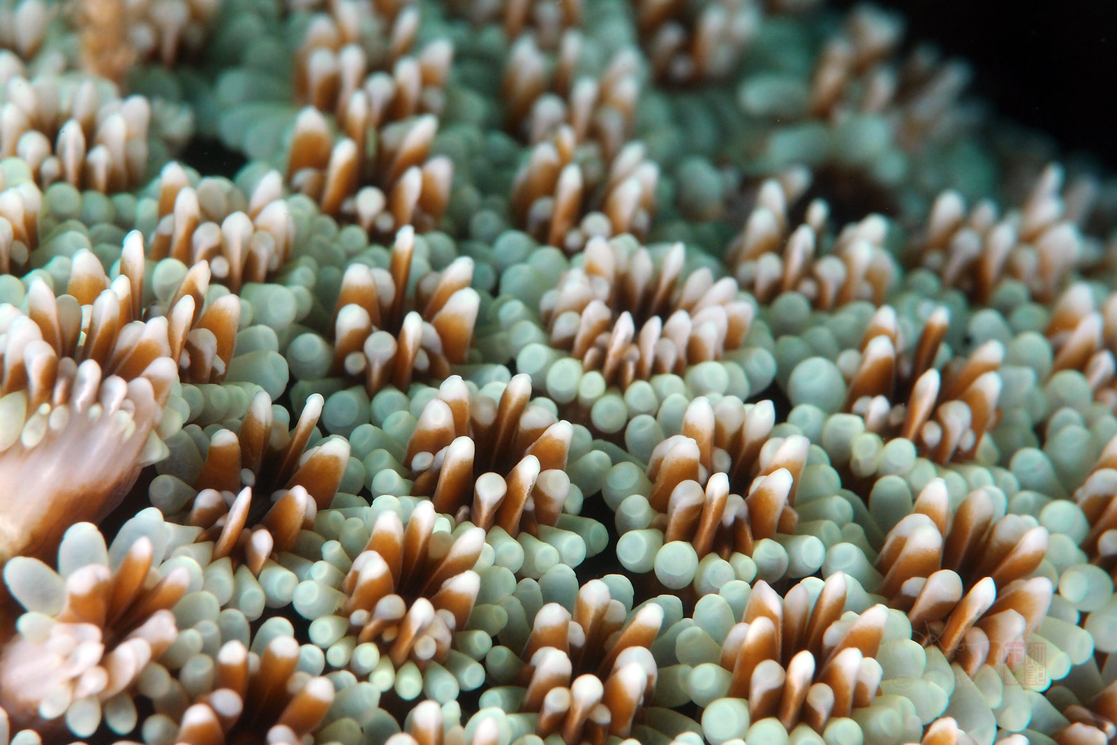
Bacteria and other microorganisms often get a bad rap, being painted solely as agents of disease and infection. In reality, the microorganisms that live on and within humans are mostly commensal, and do not cause any harm. In order to combat this misunderstanding, a key goal for our scientific illustration was to depict the organisms of the microbiome in a non-threatening way. To achieve this, we drew inspiration from the lush organic landscapes of underwater coral, which had complex geometric shapes similar to what we wanted to evoke. Coral reefs are also a vibrant symbiosis of life and biodiversity, another parallel to our own microbiomes. Like coral reefs, the human microbiome is a vital ecosystem.
The scientific illustrators at AXS Studio aren’t the only ones who drew a connection between reefs and the microbiome. Another source of inspiration for us was the work of artist Rogan Brown. His meticulously detailed reefs of microorganisms are crafted using layered cut-paper and give viewers an appreciation for the beauty and complexity of life on this scale.
Visual research of the human microbiome
With the coral reef metaphor in mind, we set forth to create a first draft of the cover. We researched over 35 cell types described in three studies from this issue of Nature to ensure we represented their shape and relative sizes accurately. In order to demonstrate the true diversity of the human microbiome, we represented several populations from different parts of the body in this single composition. Despite the many species we represented, the resulting scientific illustration is a snapshot of only a fraction of the whole human microbiome—a highly diverse ecosystem that lives within and on our bodies.
Bringing the human microbiome to life!
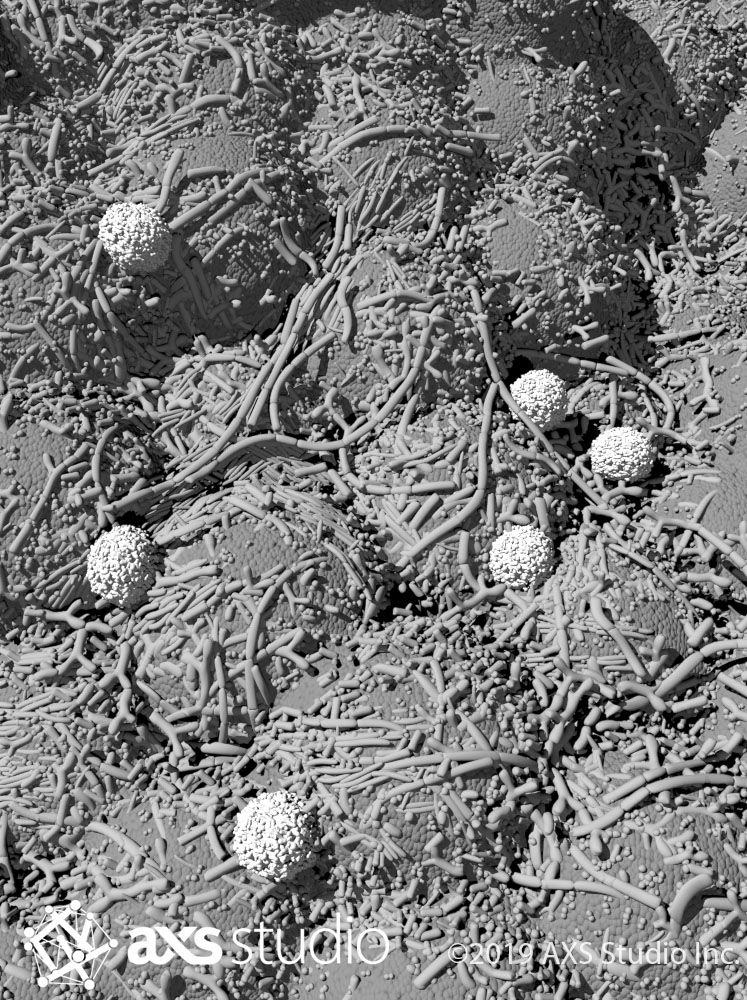
As with all 3D scientific illustrations, we began with an initial greyscale rough draft. The microbiome illustration was modeled in 3D by one of our talented medical illustrators. At this stage, we set up the scene and experiment with different camera angles and layouts. By sampling a variety of options, we arrive at the most visually pleasing composition that is certain to turn heads and encourage a closer look—the goal of a cover illustration! With this much geometry, a 3D scene file can get quite “heavy” and challenging to work with on a computer. To keep the scene light, our Head of Animation, Julian Kirk-Elleker, used procedural modeling techniques to place two-thirds of the bacteria, and hand-placed the remaining third. He then posed many of the bacteria to optimize the composition and lead the viewer’s eye through the complex microbiome scene.
Colouring the colourless human microbiome
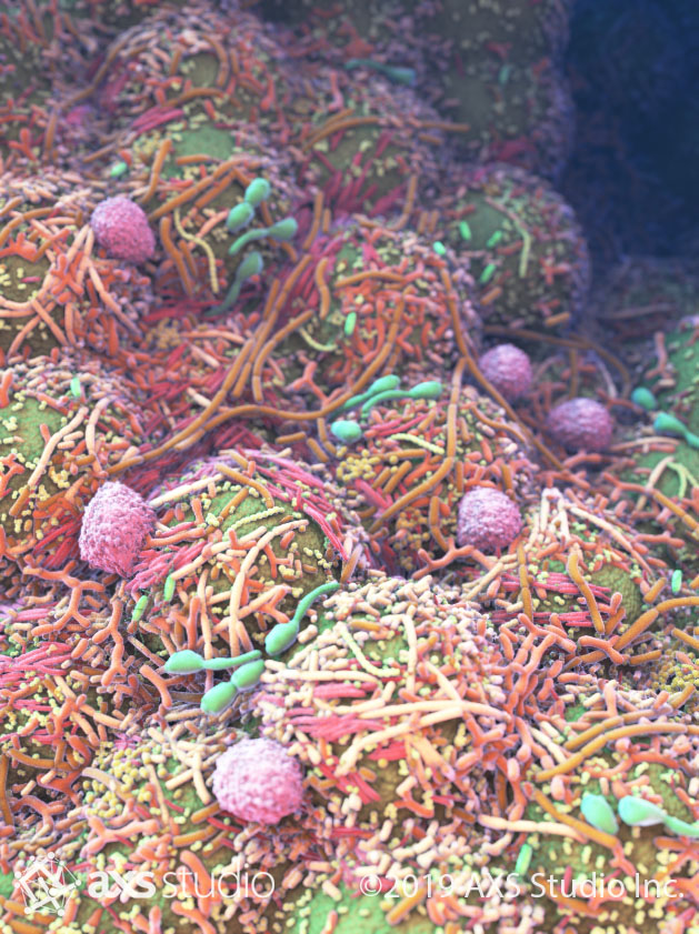
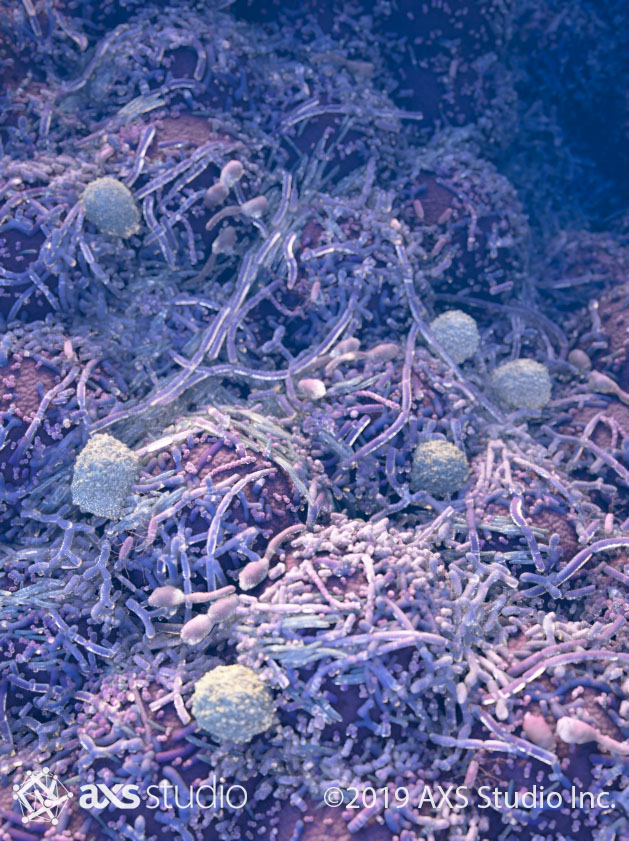
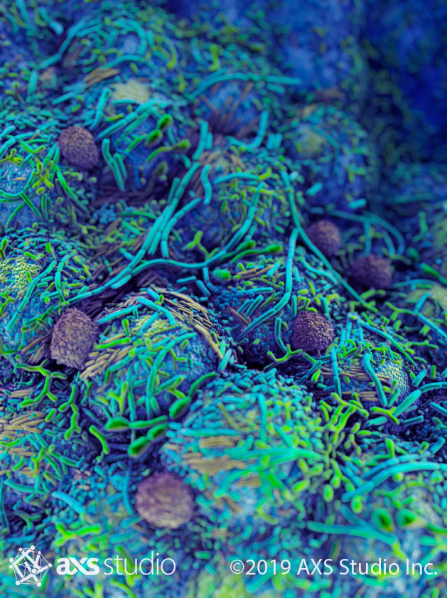
Once the rough draft layout was approved, it was time to add colour! In reality, the bacteria of the human microbiome—like much microscopic life—are colourless. As scientific artists, we often add colour to micro- and nanoscopic objects for design purposes, such as differentiating and highlighting objects, and to create more interesting and engaging images. A challenge with this human microbiome illustration was to include a lot of visual detail without overwhelming viewers. The different cells and microbes needed to look distinct, yet cohesive. Julian developed and sampled several different colour palettes to come up with a visually pleasing solution.
In the end, we decided on a combination of all the different colour options by incorporating the elements we liked most from each. Julian used several visual strategies to achieve the final look. He avoided excessive value-contrast by using mostly hue and saturation to distinguish between microbe species. He added a subtle hue gradient from blue in the top right to yellow-green in the bottom left to maintain visual coherence and gestalt. By using a depth of field effect and contrast, Julian was able to focus attention on the middle third of the image, where the title was to be placed.
©2019 AXS Studio
When Nature Vol. 569, No. 7758 hit shelves and mailboxes ahead of World Microbiome Day, it featured a cover rich in detail and vibrating with colourful energy, inviting readers to explore the fascinating research that has widened our understanding of the many microbes with which we coexist.





One Response
Wow, I just found you guys work on Creativeboom.com and I loved it! The 3d animation of your channel… and now see how you make an illustration based on a microscopic photograph is really amazing! I would love to receive a newsletter of your blog posts.